
From this tutorial you’ll learn how to use Contact Form 7 JetElements module for Elementor.
Contact Form 7 module helps you to display your existing contact forms on the website’s page.
[notice type=”warning”]You have to create a contact form using Contact Form 7 plugin before placing it to your website’s page. Please, install and activate Contact Form 7 plugin if you haven’t already done it.
Contact Form 7 JetElements Module for Elementor
Content 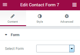
- Select Form — here you can select one of the existiing forms to embed it to the website’s page layout. You can create one using Contact Form 7 or create Your own if You have a basic knowledge in HTML.
To learn more about how to create contact forms feel free to read Creating Forms Using Contact Form 7 Plugin and How to Create Custom Layout for Contact Forms Using Contact Form 7 tutorials.
Style
Form Texts 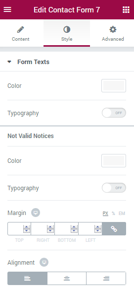
- Color — here you can set the color of the module texts using color picker tool.
- Typography — turn the option on to view the typography settings. They are similar to the typography settings of other JetElements modules.
Not Valid Notices
- Color — here you can set the color of the module notices texts using color picker tool.
- Typography — turn the option on to view the typography settings. They are similar to the typography settings of other JetElements modules.
- Margin — input the values for the notices margins in the required fields.
- Alignment — set the centered, left or right alignment for the notices.
Controls 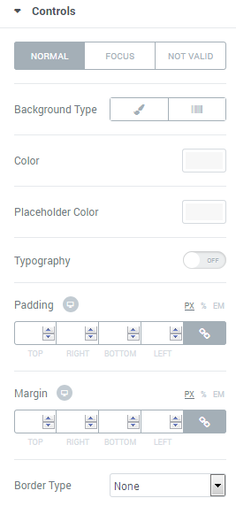
You can customize the appearance of Contact Form controls using the Normal, Focus or Not Valid mode. Just switch between the modes using the corresponding buttons.
- Background Type — in this block you can choose, whether you want to use classic or gradient type for the controls. The customization options vary for each type. The settings are similar to the common background type settings for other JetElements modules.
- Color — in this block you can set the color of the module controls using color picker tool.
- Placeholder Color — in this block you can set the color of the placeholder using color picker tool.
- Typography — turn the option on to view the typography settings. They are similar to the typography settings of other JetElements modules.
- Padding — here you can set the preferable custom padding for the controls. Fill in the values for the top, bottom, right and left padding in pixels to apply your custom padding.
- Margin — input the values for the controls margins in the required fields.
- Border Type — here you can define the needed border type for the controls. It can be dotted, dashed, double or solid.
- Border Radius — here you can define the values for the radius of the selected border.
- Box Shadow — enable this option if you want to access the shadow advanced settings for the controls, and need to apply shadow for them.
- Textarea Minimal Height — use the arrows to choose the suitable minimal height.
Submit Button 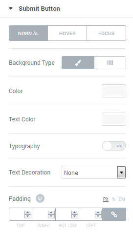
You can customize the appearance of Contact Form Sumbit Button using the Normal, Hover or Focus mode. Just switch between the modes using the corresponding buttons.
- Background Type — in this block you can choose, whether you want to use classic or gradient type for the button. The customization options vary for each type. The settings are similar to the common background type settings for other JetElements modules.
- Text Color — in this block you can set the color of the button text using color picker tool.
- Typography — turn the option on to view the typography settings. They are similar to the typography settings of other JetElements modules.
- Text Decoration — here you can apply the underlining for the text (e.g., on hover).
- Padding — here you can set the preferable custom padding for the button. Fill in the values for the top, bottom, right and left padding in pixels to apply your custom padding.
- Border Type — here you can define the needed border type for the button. It can be dotted, dashed, double or solid.
- Border Radius — here you can define the values for the radius of the selected border.
- Box Shadow — enable this option if you want to access the shadow advanced settings for the button, and need to apply shadow for it.
- Fullwidth Button — enable this option if you want to display the fullwidth button.
Alerts 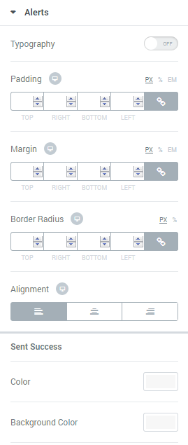
- Typography — turn the option on to view the typography settings. They are similar to the typography settings of other JetElements modules.
- Padding — here you can set the preferable custom padding for the alerts. Fill in the values for the top, bottom, right and left padding in pixels to apply your custom padding.
- Margin — input the values for the alerts margins in the required fields.
- Border Radius — here you can define the values for the radius of the selected border.
- Alignment — set the centered, left or right alignment for the module alert messages.
- There are 4 different types of the module alert messages. They are:
- Sent Success;
- Sent Error;
- Not Valid;
- Spam Blocked.
You can customize each one of them using the following customization settings.
- Color — in this block you can set the color of the alert using color picker tool.
- Background Color — in this block you can set the background color of the alert using color picker tool.
- Border Type — here you can define the needed border type for the alert block. It can be dotted, dashed, double or solid.
- Box Shadow — enable this option if you want to access the shadow advanced settings for the alert block, and need to apply shadow for it.