From this tutorial you’ll learn how to change columns width on Single product page in WooCommerce.

Changing Columns Width
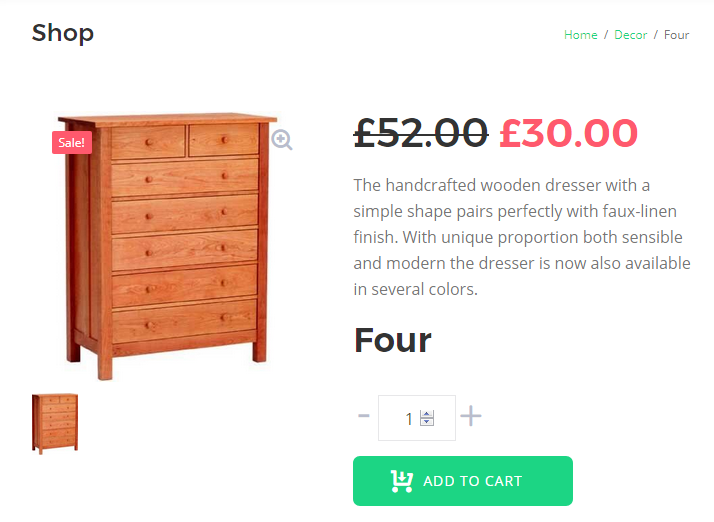
- First, let’s check the Single product page in WooCommerce. Here you can see the content separated in columns (e.g., there are two columns, and when you view the page’s content on a tablet or a mobile device, there is one column).
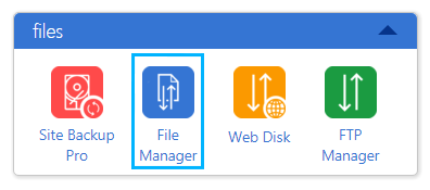
- Let’s access the column width parameters on the page. To do it, please, open your hosting server cPanel and navigate to File Manager.
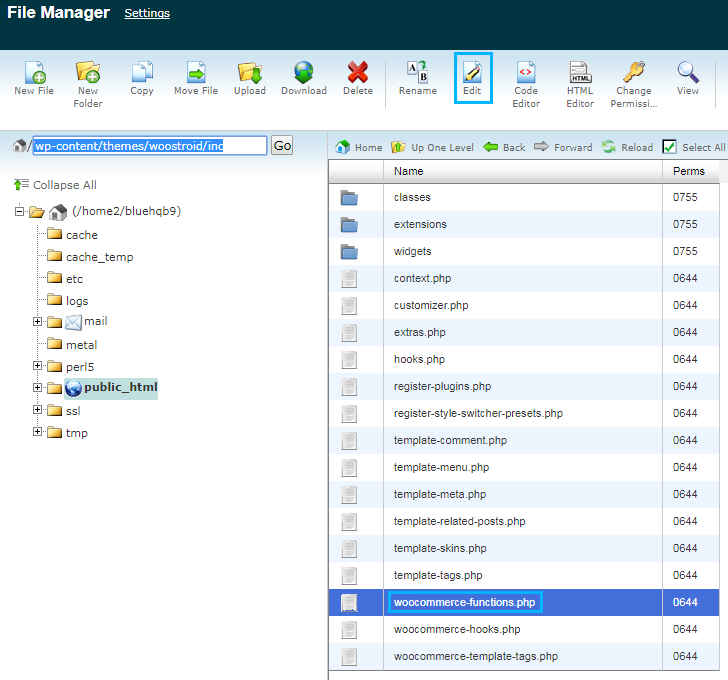
- Here go to your active theme folder (wp-content/themes/your-theme). Open inc directory. Here you can see woocommerce-functions.php file. Let’s edit it. To do it you can download it to your hard drive and open it via code editor (e.g., Notepad++, Sublime, etc.).The other way is to edit the file right from your File Manager using Edit option.
 Don’t forget to create a backup copy of woocommerce-functions.php file in order to be able to reverse the changes in the case something goes wrong.
 - When you opened woocommerce-functions.php file for editing, locate the following lines of code (you can do it using Ctrl+F hotkeys).
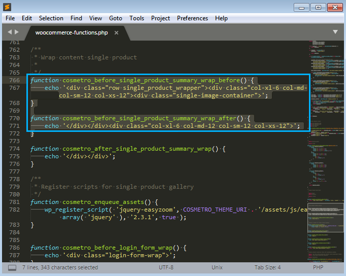
- The classes in the first function define the image block size. In the second function one can change the size of the product description block.
- In the < div > container you can see the column parameters written in Bootstrap grid system. These parameters specify the column width for different breakpoints (small, extra small, medium and large).If you’re not familiar with the Bootstrap grid system, here’s the short guide that may help you understand it.
- col – stands for the columns that are used for the Single product page.
Right beside the col tag you can see the breakpoint for it. Here is the short list of breakpoints that are used for the columns:
- xs – extra small (<576px);
- sm – small (≥576px);
- md – medium (≥768px);
- lg – large (≥992px);
- xl – extra large (≥1200px).
Note, that when you use minimum breakpoint, it applies to the one breakpoint you’ve defined and to all the other breakpoints above it, if you haven’t defined other breakpoints (e.g., col-md-4 applies to medium, large, and extra large devices, but not the first xs and sm breakpoints). - Now let’s overview the column width parameters. In the Bootstrap grid system the maximum number of columns one might use in the row is 12. In the columns classes one indicated the number of columns he wants to use out of the possible 12 per one row (e.g., .col-3 means that you want to use 3 of the possible 12 columns, and the column will occupy ¼ of the row’s width).In our case, we used one column that occupied ½ of the row for extra large screens, and a single column for medium, small and extra small screens.
col-xl-6 col-md-12 col-sm-12 col-xs-12
- Just change the column classes according to your needs and save the changes. Now you can upload woocommerce-functions.php file to its previous location on server and refresh your website’s Single product page to view the changes.