Managing your Collection List Page in Shopify is very important for efficient sales organization on your online store.
The collection list page is the page that displays all available product collections. For example, you can group them according to specific criteria such as product type, season, style, etc. Of course, customers can use this page to quickly find the collection they are looking for and view the items it contains.
Use simple Shopify tutorials that we update all the time. As a result, you will learn how to manage the settings of your Shopify store on your own.
Managing the Collection List Page allows you to:
- Organize Collections. You can organize collections in a specific order to help shoppers find what they need faster.
- Show Current Collections. You can also easily update the collections list page to display the latest collections you have created or current products related to current events or holidays.
- Increase sales. In fact, you can use the collections list page to offer related products and promotions, which can increase sales and the average purchase of buyers.
- Improve SEO. For example, proper use of metadata, keywords, and collection descriptions can help your collection listing page rank high in search engines. This can lead to more traffic to your website and more sales.
For example, you can control how the collections list is displayed thanks to multiple layout options in the Vendy Pro theme.
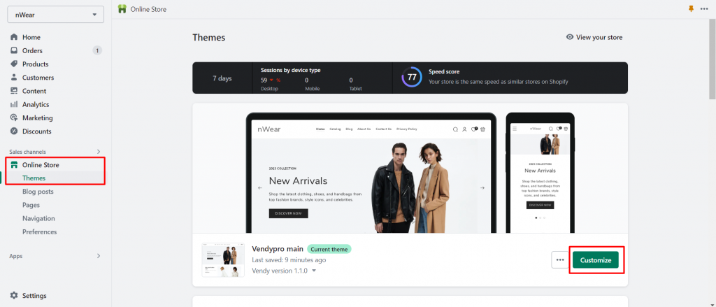
To do so, open the Shopify admin panel and go to Online Store > Themes > Vendy Pro > Customize.
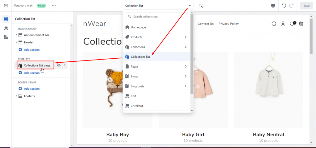
Select the Collection list page from the top dropdown and press on the Collections list page section to manage its settings.
You will see available customization options for the Collection list page:
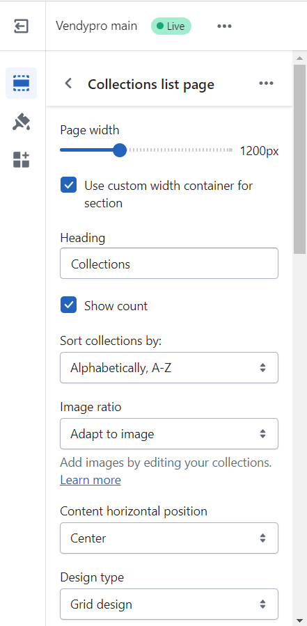
Page width – you can enable the Use custom width container for section option and set the needed container width for desktops.
Heading – set the title you want to be displayed on the collection page.
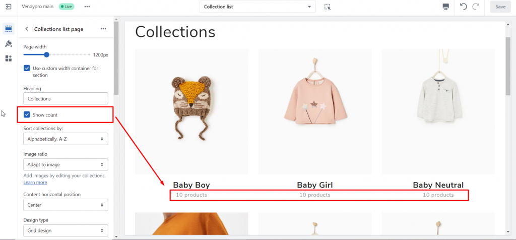
Show count – enable if you want to display the number of products in each collection.
Sort collections by: allow you to set the needed order of collections’ display
- Alphabetically, A-Z
- Alphabetically, Z-A
- Date, new to old
- Product count, high to low
- Product count, low to high
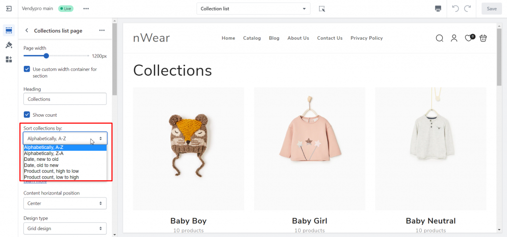
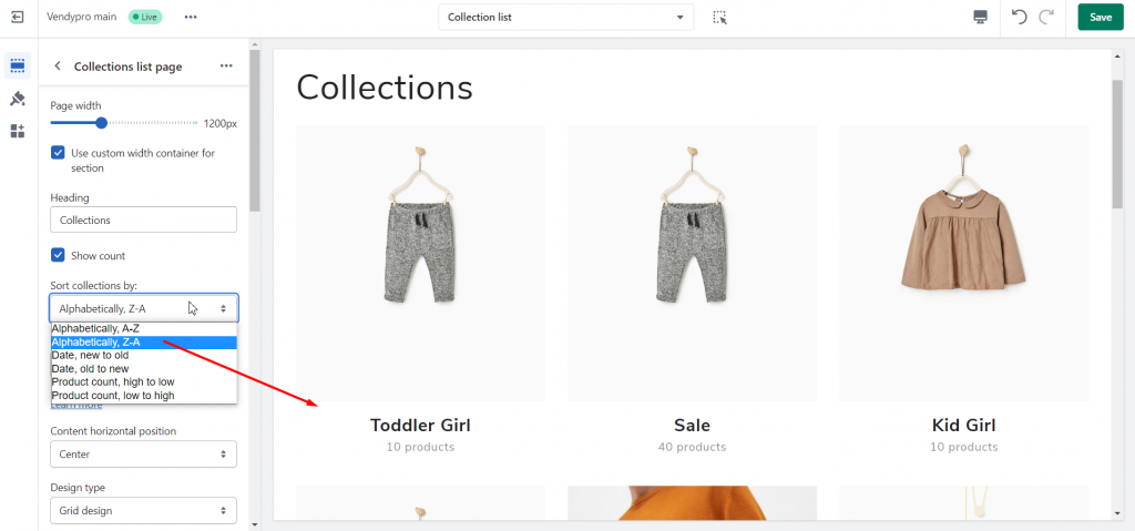
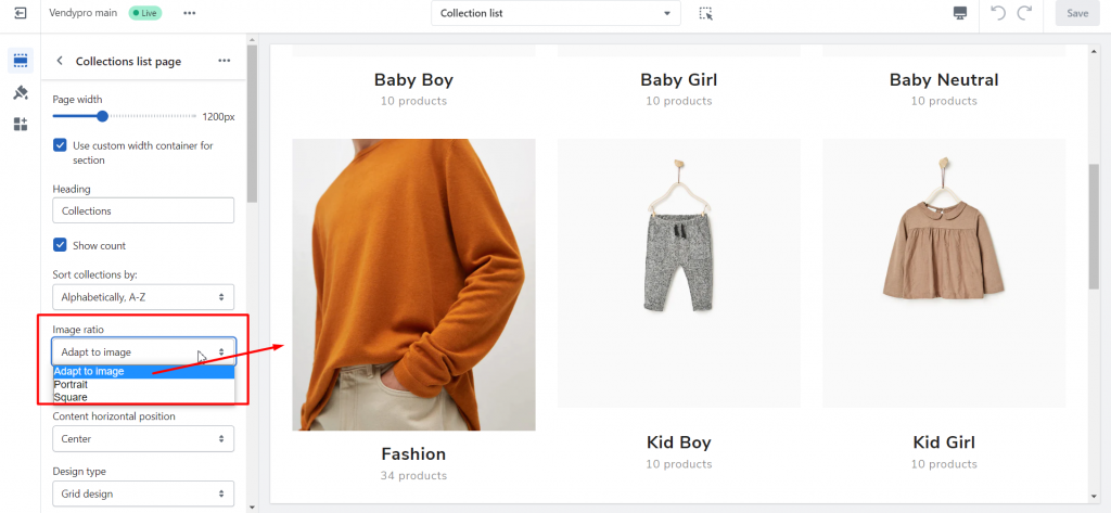
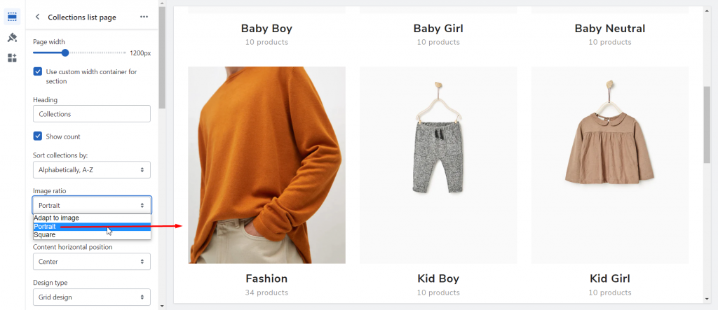
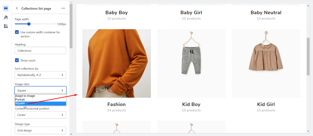
Image ratio – select Adapt to image, Portrait, or Square size of collection images.
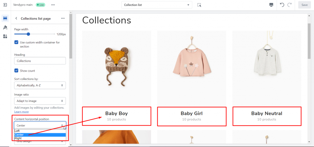
Content horizontal position – set the needed alignment for collection titles and the number of products: Left, Center, or Right:
Design type – select the layout you prefer:
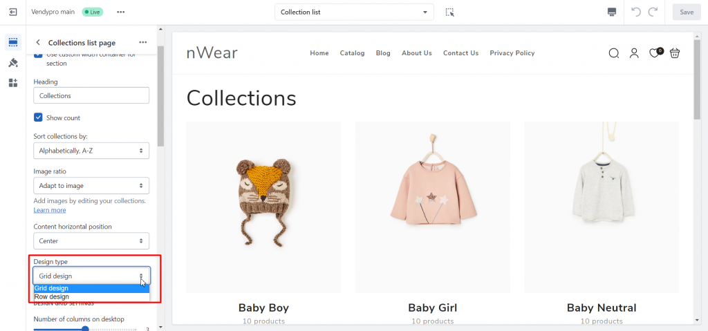
- Grid design – displays collections in a grid (up to 5 collections per row)
- Row design – displays each collection in a single row
Each design type provides a wide range of layout options. So scroll down to set up the needed display.
Design grid settings
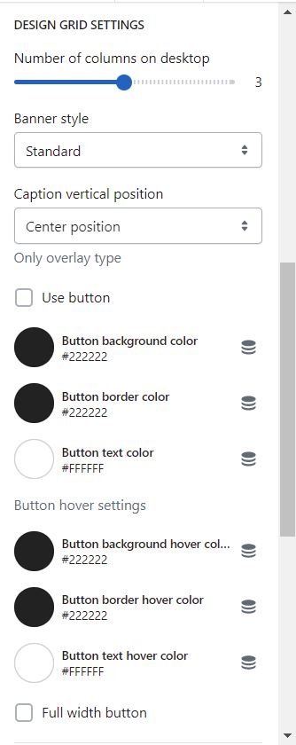
- A number of columns on the desktop – select the number of collections per row up to 5.
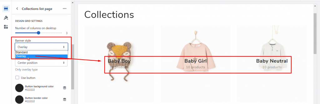
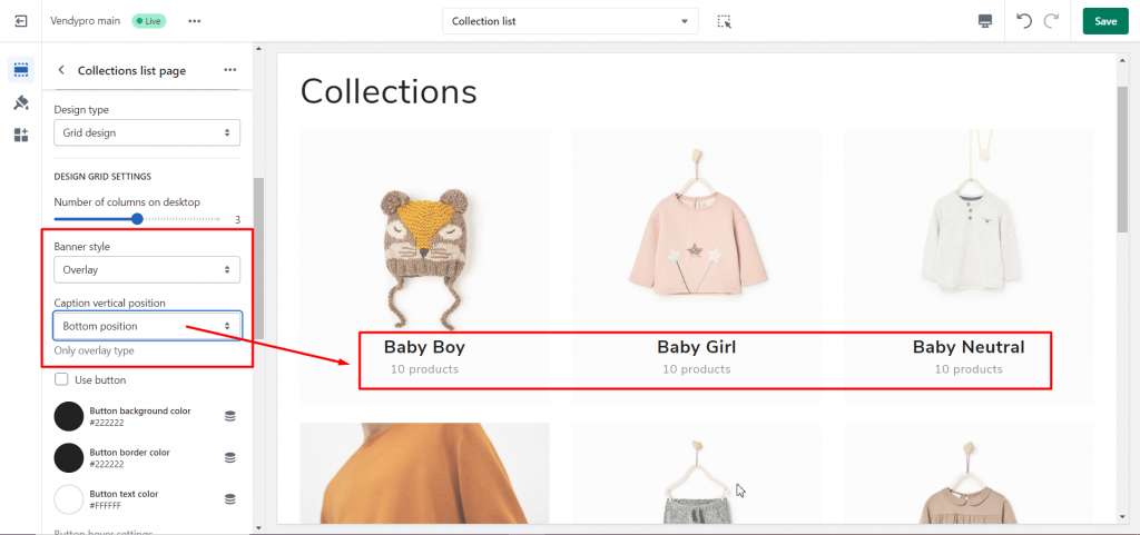
- Banner style: Standard (information under collection images) or Overlay (information over collection images):
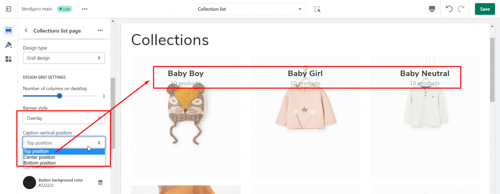
- Caption vertical position (for overlay type) – the position of information: for example Top, Center, or Bottom:
- Use button – select to display a collection title and the number of products as the button:
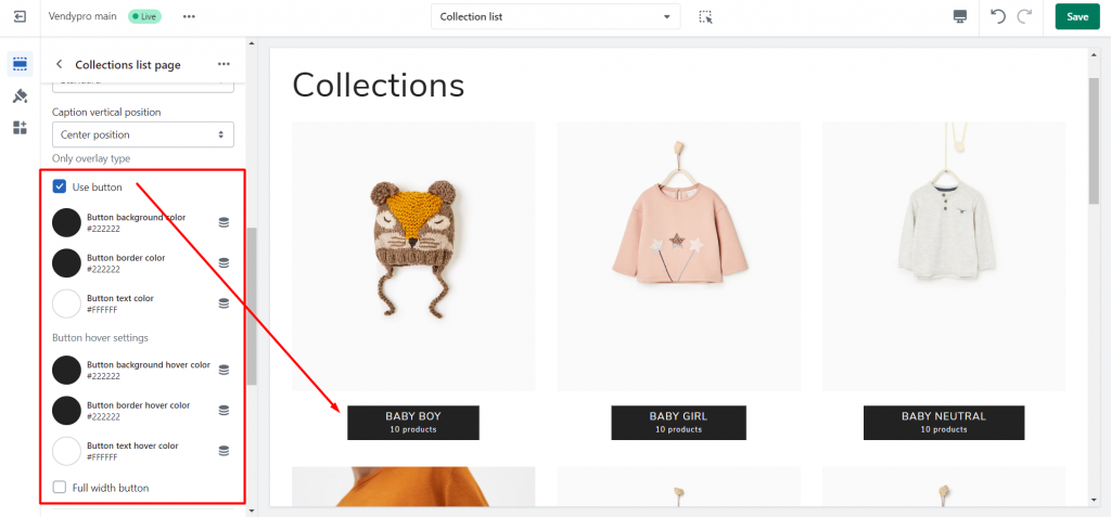
Button settings:
- Background color
- Border-color
- Text color
- Background hover color
- Button border hover color
- Button text hover color
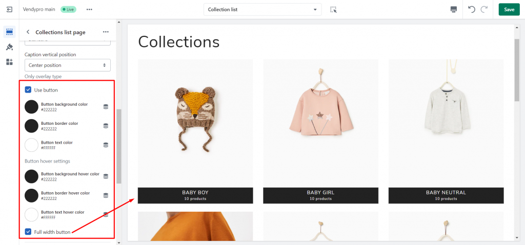
- Full-width button – enable if you want the button to be stretched through the full width of a collection image
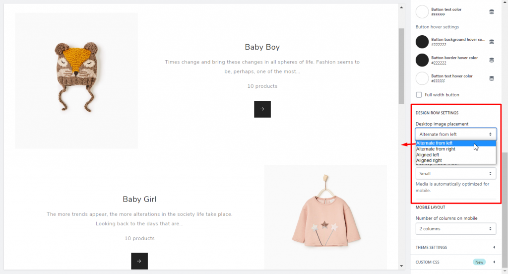
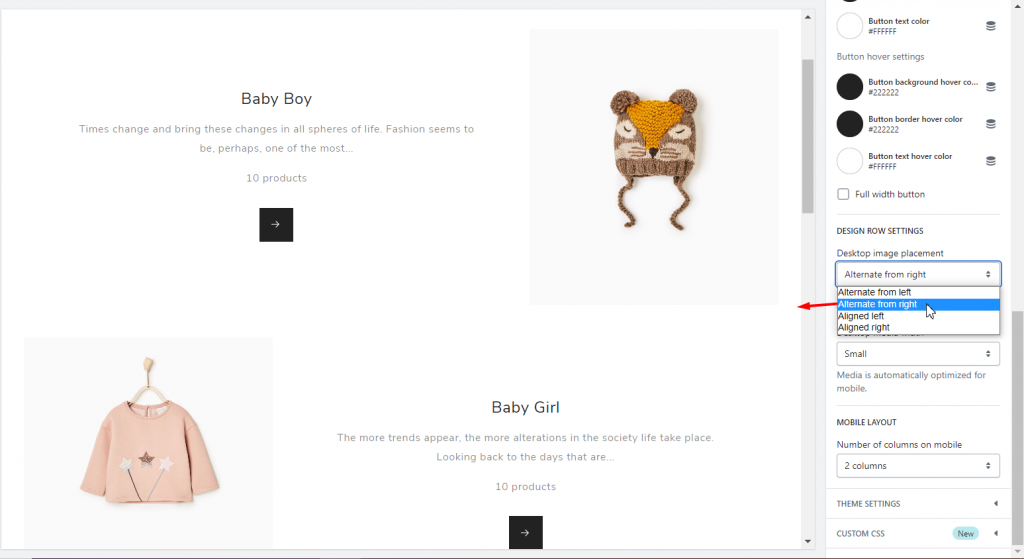
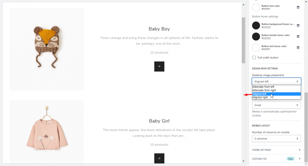
Design row settings
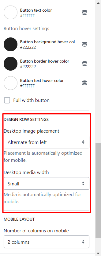
- Desktop image placement – layout options for the position of a collection image in a row (list) design type:
- Alternate from left
- Alternate from right
- Aligned left
- Aligned right
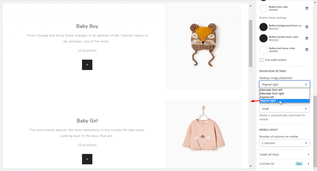
Placement is automatically optimized for mobile.
- Desktop media width – the width of a collection image:
- Small
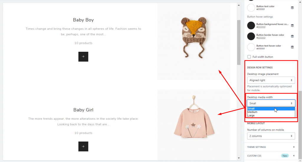
- Medium
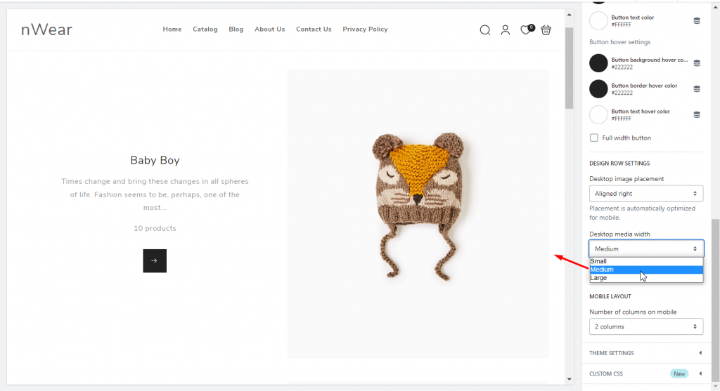
- Large
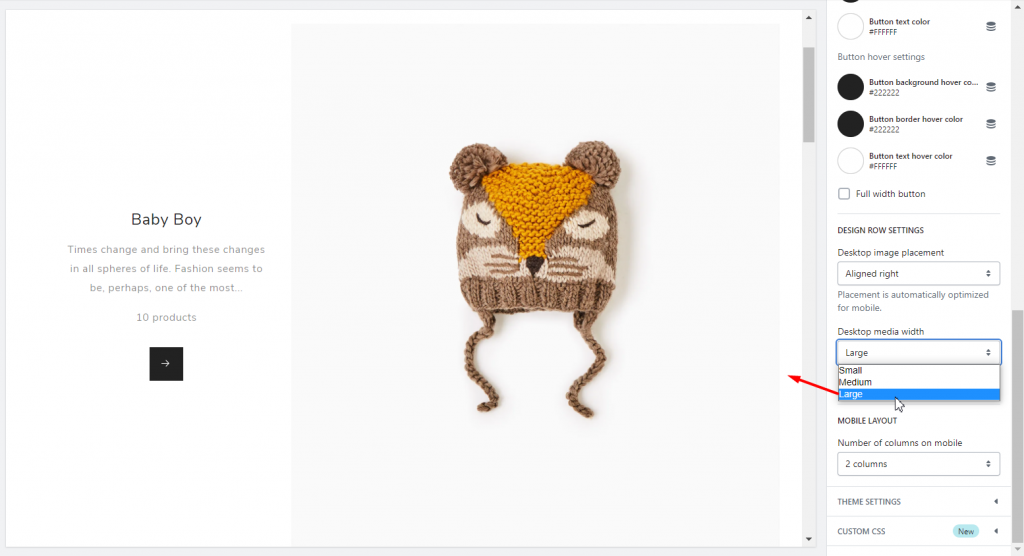
Of course, media is automatically optimized for mobile.
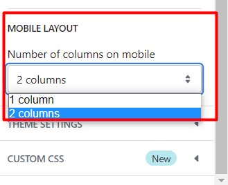
MOBILE LAYOUT area also allows setting the Number of columns on mobile: 1 or 2 columns per row.
Finally, now you can display the Collection List Page in Shopify per your needs! In brief, you can also read how to manage Product Card Badges in Shopify. If you have any additional questions, contact us. We also welcome your questions.