
Sometimes general settings of the module are not enough to adjust its appearance to the whole page’s style. That’s where advanced settings come in handy.
From this tutorial, you’ll learn about managing Accordion module advanced settings.
Accordion Module Advanced Settings
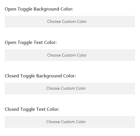
- Open Toggle Background Color — here you can choose the custom color using the color picker to apply it to the opened toggle.
- Text Color — here you can choose the color using the color picker to apply it to the text in the toggle in the opened state.
- Closed Toggle Background Color — here you can choose the custom color using the color picker to apply it to the closed toggle.
- Text Color — here you can choose the color using the color picker to apply it to the text in the closed toggle.
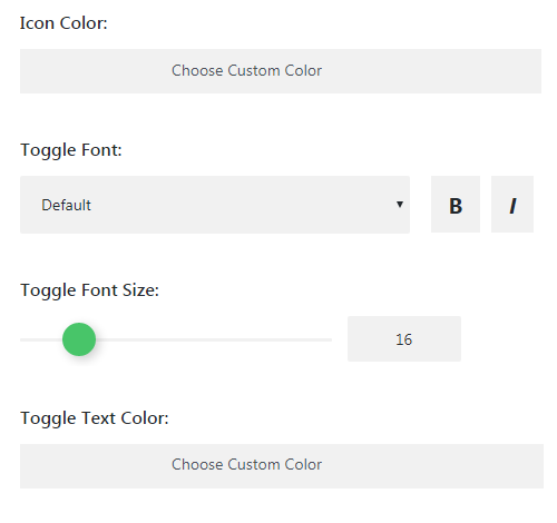
- Icon Color — choose the icon color using color picker tool.
- Toggle Font — here you can define the font for toggle text.
- Font Size — in this block you can set the size for toggle text.
- Text Color — here you can pick the color of the toggle text.
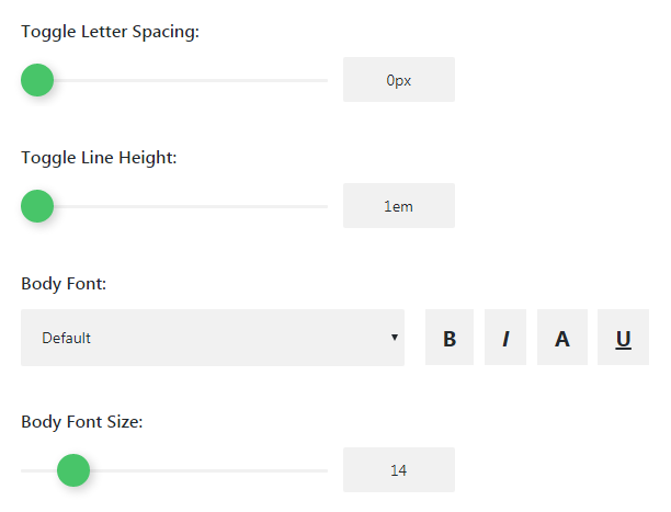
- Toggle Letter Spacing — here you can define the space between letters of the text.
- Line Height — choose the line height for toggle text.
- Body Font — choose the font for main body text. You can also choose the style to use for the text. It can be bold, italic, underlined etc.
- Size — here define the body font size for the toggle main body text.
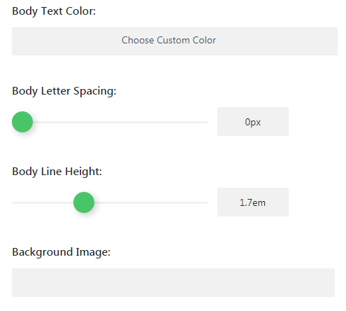
- Body Text Color — here you can pick the color of the main toggle text.
- Letter Spacing (Body Text) — use this option to define the space between letters in the main text of the toggle.
- Line Height (Body Text) — here you can set the height of the body text lines.
- Background Image — here you can upload or pick from the Media Library an image to use it as a background.
This tutorial is based on LifeisWild Wild Life WordPress theme.