From this tutorial you’ll learn how to utilize Posts JetElements module style for Elementor.
Style
Column 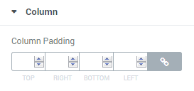
- Column Padding – here you can define the custom padding values for the column (in pixels).
Post Item 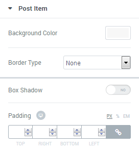
Here you can customize the post item background color. Click on the Background Color area and use color picker tool to select the suitable color.
- Background Color — in this block you can set the color to use it in the post item background.
- Border Type — here you can select the type of the border from the dropdown menu.
- Box Shadow — enable this option if you want to access the shadow advanced settings for this module, and need to apply shadow for it.
Post Thumbnail (Image) 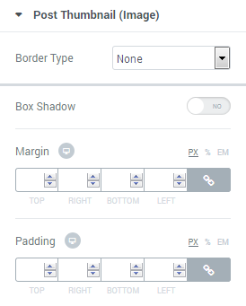
- Border Type — here you can select the type of the border from the dropdown menu.
- Box Shadow — enable this option if you want to access the shadow advanced settings for this module, and need to apply shadow for it.
Post Item Content 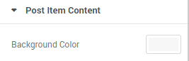
- Background Color — in this block you can set the color to use it in the post item content background.
Title 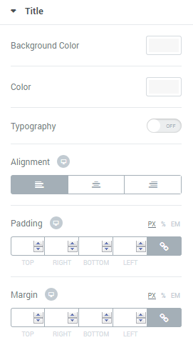
Here you can apply custom appearance settings for the post title.
- Background Color — in this block you can set the color to use it in the title background.
- Color — in this block you can select the color for the post title.
- Typography — turn the option on to view the typography settings. They are similar for Title, Meta, Excerpt and Button blocks.
- Size — define the font size of the animated box title.
- Family — here you can set the font family for the title.
- Weight — in this block you can select the suitable font weight.
- Transform — here you can choose from the dropdown menu, if you want the title to be shown in uppercase, lowercase, capitalize or normal way.
- Style — in this block you can choose from the dropdown menu the style for the font. It can be normal, italic (the characters look similar to handwriting) and oblique (the characters are slightly inclined to the right).
- Line Height — in this field you can set the height of the title line.
- Letter Spacing — here you can set the space between letters.
- Alignment — here you can define the preferable title alignment. The title can be placed to the left, to the right, or remain centered.

Meta 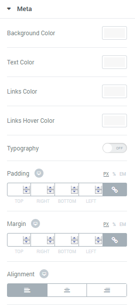
Here you can apply custom appearance settings for the post meta information.
- Background Color — in this block you can set the color to use it in the meta information background.
- Text Color — in this block you can select the text color for the post meta information.
- Links Color — in this block you can select the links color for the post meta information.
- Links Hover Color — in this block you can select the links hover color for the post meta information, that will be displayed when the visitor puts the mouse to the link area.
- Typography — turn the option on to view the typography settings. They are similar for Title, Meta, Excerpt and Button blocks.
- Meta Divider — here you can input your custom divider to use it for the meta information block.
- Divider Gap — here you can define the gap for the divider.
- Alignment — here you can define the preferable meta alignment. The information can be placed to the left, to the right, or remain centered.
Excerpt 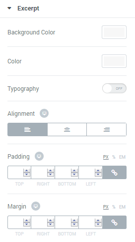
Here you can apply custom appearance settings for the post content excerpt.
- Background Color — in this block you can select the color for the excerpt background.
- Color — in this block you can select the color for the post content excerpt.
- Typography — turn the option on to view the typography settings. They are similar for Title, Meta, Excerpt and Button blocks.
- Alignment — here you can define the preferable excerpt text alignment. The information can be placed to the left, to the right, or remain centered.
Button 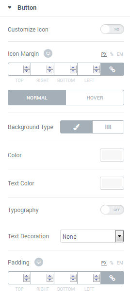
Here you can apply custom appearance settings for the Read More button.
- Customize Icon — enable this option if you want ot apply custom appearance settings for the icon.
- Icon Position — here you can select the preferable icon position (it can be placed before text or after text).
- Size — here you can define the suitable icon size.
- Color — here you can select the icon color using color picker.
- Margin — here you can define the margins for the icon.
Here you can switch from customizing Normal to Hover mode. To switch to customizing Hover you need to click on the corresponding button.
- Background Type — in this block you can choose, whether you want to use classic or gradient type for the background. The customization options vary for each type.
Classic Background Type
- Color — here you can set background color for the element using color picker tool.
- Image — here you can choose the image you want to use as a background. Select the image from the media library or upload it to define it as a background in this block. When the image is uploaded, you’ll be able to define its position, alignment, turn on repeat and set the necessary size.
Gradient Background Type
- Color — here you can set background color for the module using color picker tool.
- Location — here you can define the proportion for the first color in the gradient background.
- Second Color — here you can set the second color to use in the gradient background.
- Location — here you can define the proportion for the second color in the gradient background.
- Type — define, if you want to use linear or radial type of the gradient.
- Angle — in this block you can set the angle for the gradient (in degrees).
- Border Type — here you can define the type of the border you need to use for the element.
- Box Shadow — enable this option if you want to access the shadow advanced settings for this module, and need to apply shadow for it.
- Text Color — here you need to define the color of the text of the Read More button.
- Typography — turn the option on to view the typography settings. They are similar for Title, Meta, Excerpt and Button blocks.
- Box Shadow — enable this option if you want to access the shadow advanced settings for this module, and need to apply shadow for it.
- Border Type — here you can define the type of the border you need to use for the button.
- Alignment — here you can define the preferable button alignment. The information can be placed to the left, to the right, or remain centered.
Carousel Arrows 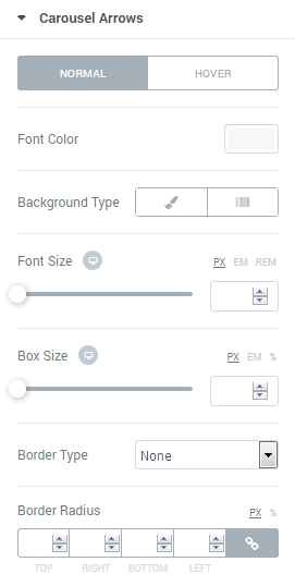
Here you can apply custom appearance settings for the Carousel Arrows.
Switch from customizing Normal to Hover mode whenever you need to switch to customizing Hover, or vice versa.
- Font Color — here you can set the font color for the element using color picker tool.
- Background Type — in this block you can choose, whether you want to use classic or gradient type for the background. The customization options vary for each type.
Classic Background Type
- Color — here you can set background color for the element using color picker tool.
- Image — here you can choose the image you want to use as a background. Select the image from the media library or upload it to define it as a background in this block. When the image is uploaded, you’ll be able to define its position, alignment, turn on repeat and set the necessary size.
Gradient Background Type
- Color — here you can set background color for the module using color picker tool.
- Location — here you can define the proportion for the first color in the gradient background.
- Second Color — here you can set the second color to use in the gradient background.
- Location — here you can define the proportion for the second color in the gradient background.
- Type — define, if you want to use linear or radial type of the gradient.
- Angle — in this block you can set the angle for the gradient (in degrees).
- Font Size – here you can define the size for the font that you’d like to use for the Carousel Arrows.
- Box Size – here you can define the size for box that you’d like to use for the Carousel Arrows.
- Border Type — here you can define the type of the border you need to use.
- Box Shadow — enable this option if you want to access the shadow advanced settings for this module, and need to apply shadow for it.
Prev Arrow Position
- Vertical Position By — define the vertical position for the prev arrow. It can be positioned at the top or at the bottom.
- Top Indent — define the vertical position indent in pixels, or use controls to define the suitable position automatically.
- Horizontal Position By — define the horizontal position for the prev arrow. It can be positioned on the left or on the right.
- Left Indent — define the horizontal position indent in pixels, or use controls to define the suitable position automatically.
Next Arrow Position
- Vertical Position By — define the vertical position for the next arrow. It can be positioned at the top or at the bottom.
- Top Indent — define the vertical position indent in pixels, or use controls to define the suitable position automatically.
- Horizontal Position By — define the horizontal position for the next arrow. It can be positioned on the left or on the right.
- Right Indent — define the horizontal position indent in pixels, or use controls to define the suitable position automatically.
Carousel Dots 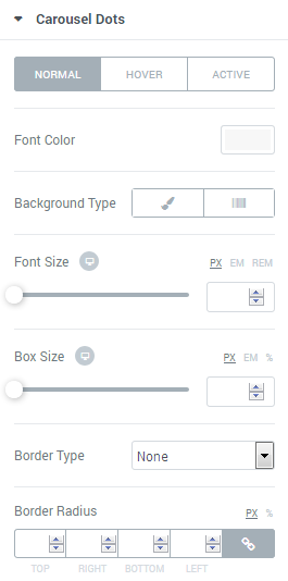
Here you can switch from customizing Normal to Hover and Active Pagination Dots style settings. Just click on the button Hover to proceed to customizing hover elements.
- Font Color — define the color of the pagination dots using color picker tool.
- Background Type — in this block you can choose, whether you want to use classic or gradient type for the simple items. The customization options vary for each type.
- Font Size — here you can select the size of the arrow font controls in pixels.
- Box Size — here you can select the size of the arrow controls box in pixels.
- Border Type — here you can define the type of the border you need to use for the Carousel Dots border.
- Box Shadow — enable this option if you want to access the shadow advanced settings for this module, and need to apply shadow for it.
- Gap — here you can define the gap between pagination dots in pixels, or use controls to set it automatically.
- Dots Box Margin — here you can define the margins for the Dots box.
- Alignment — set right, left or center alignment to use it for the dots.