From this tutorial you’ll learn how to customize pre-styled header/ footer according to your needs.
How to Customize a Logo
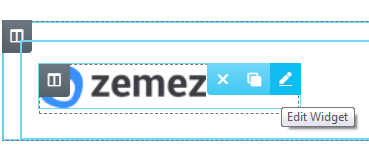
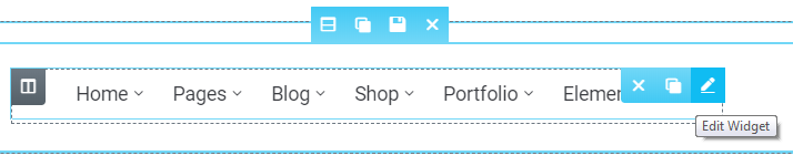
- Each widget in the section is available for customization. Hover a widget (we started with Site logo) and click Edit Widget icon.
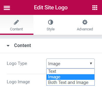
- Select Logo Type, either Text, Image or Both Text and Image.
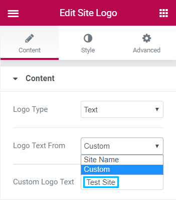
- If you select Text Logo Type, you will see a new option – Logo Text From, where you are offered either to use your Site Name or indicate a Custom text, and type it in the field below.
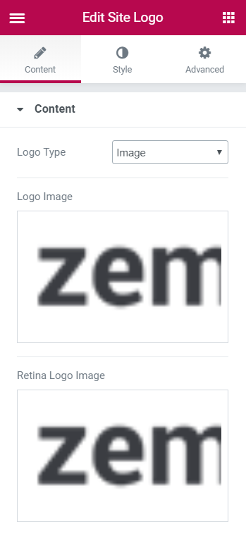
- Select Image to see additional options: Logo Image and Retina Logo Name. Here you can upload and set images to be displayed in your header/footer.
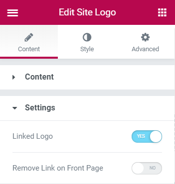
- In the Settings block you can choose whether to link logo to your site or not. Also, you are able to remove link on the Front Page.
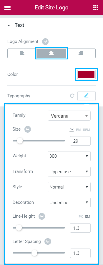
- Navigate to Style tab to customize the textual part of your logo. Here you can select Logo Alignment, Color and Typography options. In the screenshot below you can see the settings we selected.
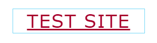
- Here’s what we’ve got.
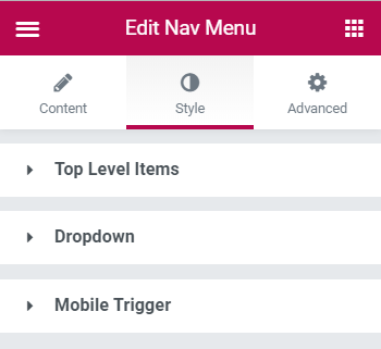
- Let’s proceed with Navigation Menu widget customization.
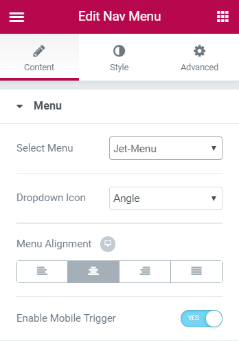
- In the Content tab you will see Menu block with several options available for customization. Here you can Select Menu for your header/footer, choose Dropdown Icon from the list, set Menu Alignment and Enable or Disable Mobile Trigger.
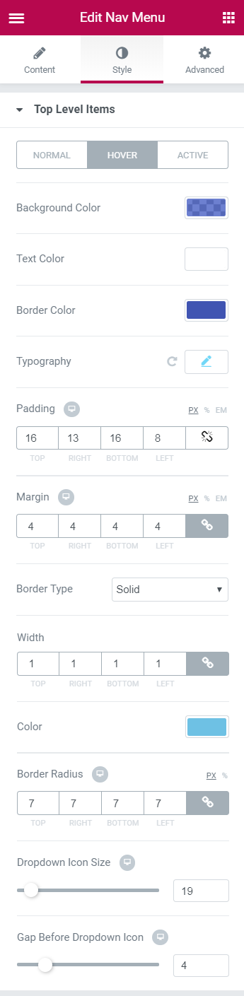
- Let’s style this menu up! Switch to Style block to view all the available style settings. You can find the example of styling up a menu in the block below.
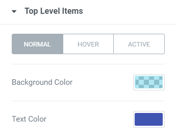
- In the Top Level Items block click on Normal button to set colors of Menu elements. Set the background color using Color picker tool (we’ve set rgba (45,190,226,0.37). Also, set Text Color (we used #4054b2 HEX color).
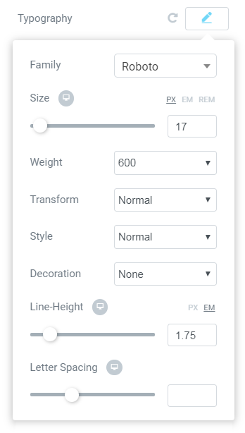
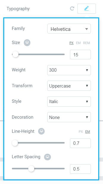
- Change Typography settings up to your needs. For this tutorial we used the following ones.
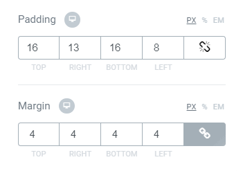
- Set your Paddings and Margins if you need to.
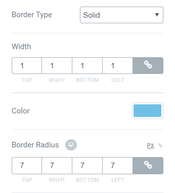
- If you want to add border to your menu buttons, select Border Type from the drop down list. We set border type to 1 px and selected its color (#6ec1e4). Input the border radius value in the Border Radius block to make the menu angles more rounded (in our example it is 7 px).
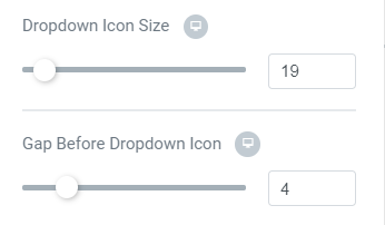
- The next option helps you change Dropdown Icon Size and Gap Before Dropdown Icon. Our settings are 19 and 4 accordingly.
- Settings in Hover and Active modes for Top Level Items are similar to Normal mode. So, you can style them up.
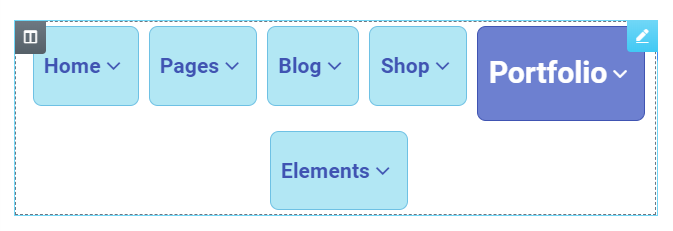
- Here’s what we’ve got on this stage.
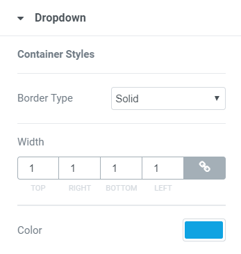
- Now, let’s style up Dropdown menu items. Here you can set Border Type and select it from the list (in our tutorial we used Solid type). Also, set its Width (for example, 1px) and Color (#0fa3e2).
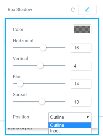
- You are able to add Box Shadow to your Dropdown menu items. Just move the following sliders or set a number in the fields on the right.
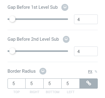
- Next, we change the value of Gap Before 1st and 2nd Level Sub. Also, you can set a Border Radius if you added a border on the previous steps.
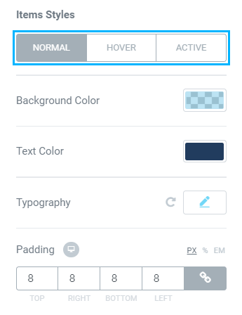
- Let’s style up Dropdown menu items. Navigate to Items Styles block. Here you can also change settings in three modes: Normal, Hover and Active. In this tutorial we set Background Color (rgba(110,193,228,0.46)), Text Color (#213c5e) and changed Padding value to 8 px.
- In this block we also change Typography settings the same way as in step 12.
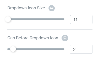
- The next settings you can change are Dropdown Icon Size and Gap Before Dropdown Icon. We set 11px and 2 px accordingly.
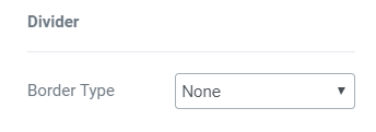
- Customize your Divider by selecting Border Type if you want to add more style to your menu.
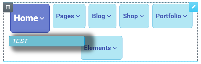
- Here’s what we’ve got after customization.
- Let’s navigate to Mobile Trigger block to style up hamburger menu when displaying in mobile mode. There are Normal and Hover modes with settings available for customization.
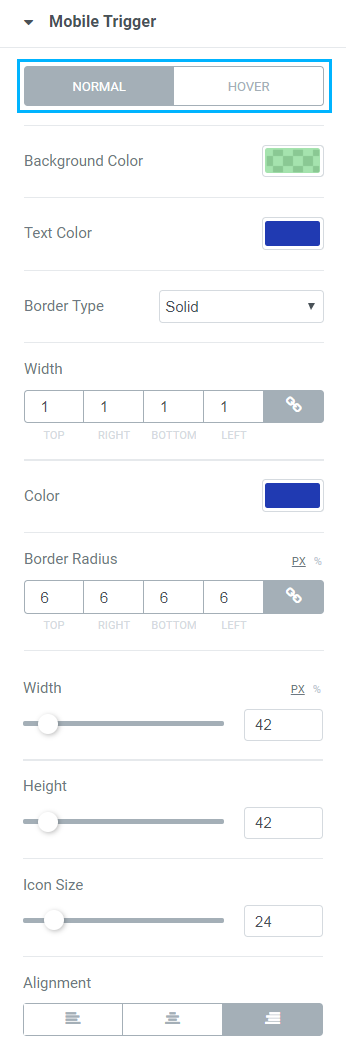
- Here’s how our hamburger menu looks after styling it up.
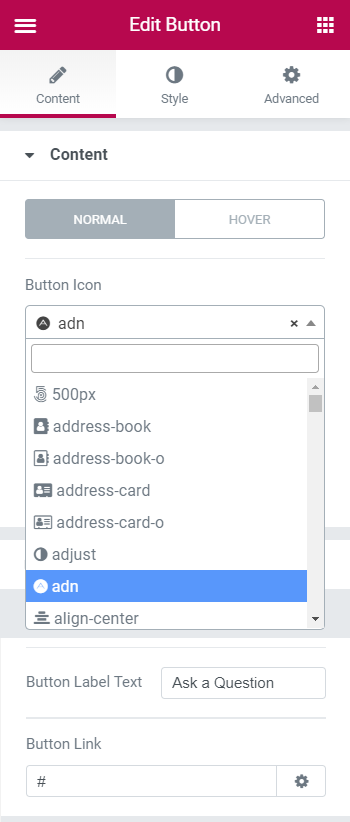
- The next widget we are going to customize is Button. Click on Edit Widget icon and navigate to Content block. Here you will see two modes: Normal and Hover with identical settings which you can change.
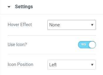
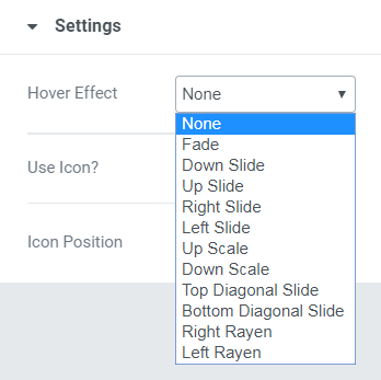
- Next, navigate to Settings block to select Hover Effect, Icon Use and Icon Position.
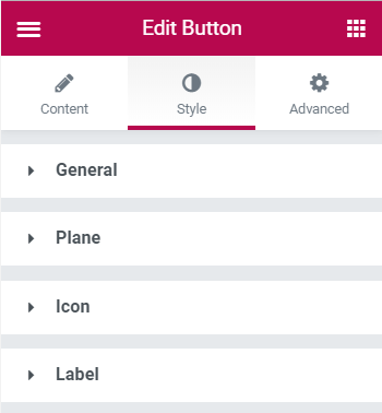
- It’s time to style up Button widget! Navigate to Style tab and find four blocks, each of them containing customization settings.
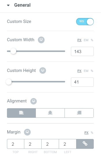
- General block allows to set Custom Icon Size, select Custom Width and Height, choose Alignment type and change Margins if needed.
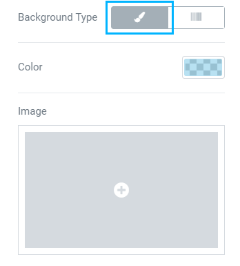
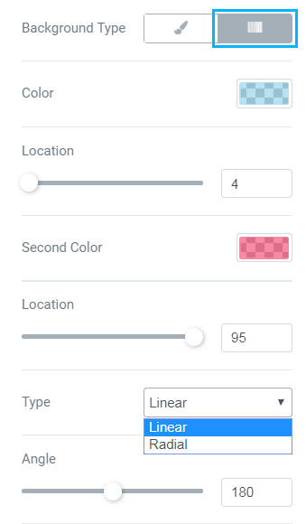
- Background Type setting has two options: Classic and Gradient.
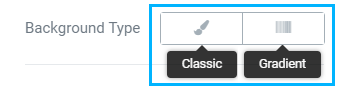
- In Classic mode you can select either Color (we used rgba (110,193,228,0.49)) or insert an Image from your Media Library.
- In Gradient mode you are offered to select two Colors to create a gradient, set their Location, Type and Angle.
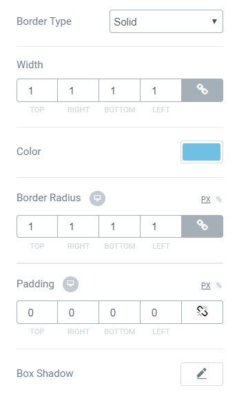
- The next settings you can see are: Border Type, Width, Color, Border Radius, Padding and Box Shadow – they all are set the same way as in previous steps.
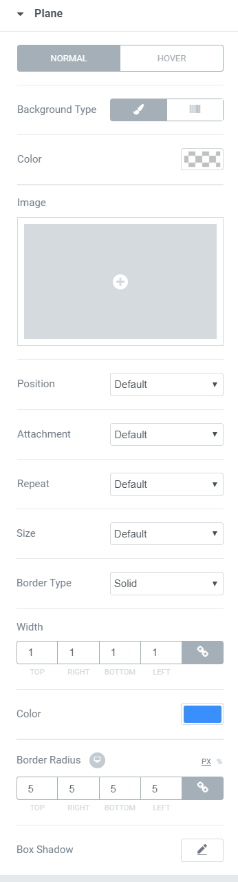
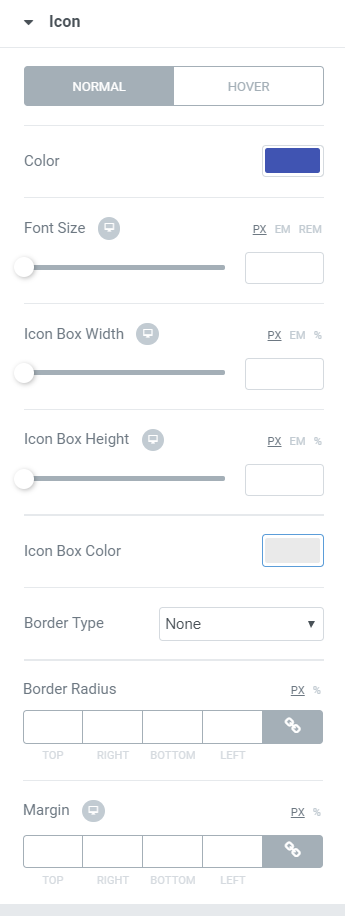
- Plane and Icon blocks allow to customize the Button’s plane and icon accordingly using the same settings as in previous steps.
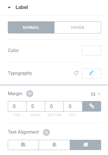
- Label block contains settings for Button’s text customization.
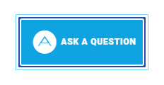
- Here’s how our Button looks after styling it up!
How to Customize a Menu
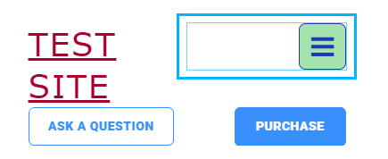
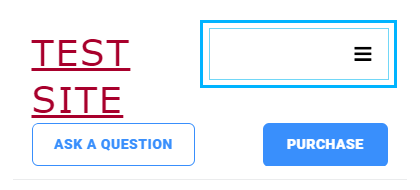
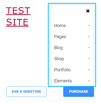
To see the effect of Mobile Trigger option you need to choose Mobile preview mode in Elementor bottom panel on the left.
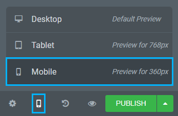
On the right side you will see a screen imitating mobile one. Mobile Trigger turns navigation menu into a hamburger one, which rolls down showing a list of menu items.
How to Customize Dropdown Menu Items Appearance
How to Customize Button Appearance
We’ve successfully covered all the customization settings, and now you can go ahead creating your own headers and footers!