Hi everyone! Let’s learn how to create a Parallax background in the Elementor page builder. This technology is being used more and more often, as it looks really impressive and cool. Also, Still, you must’ve noticed that there is no such option as Elementor Parallax background, so it will take some effort to make a background with such an effect. Be sure, everything is rather simple!
First of all, what do you know about Parallax? Parallax is a visual effect that makes usual scrolling more attractive (background moves slower than the content). Today, Parallax Scrolling is a kind of trend and we want to share some tips on how to implement it easily. The technique itself is based on the rate of change of the background-position. This ilusion of three-dimensional space is achieved with the help of several layers, which are superimposed on each other and move at different speeds when scrolling. Due to Parallax, you can create not only a three-dimensional effect but also apply it to icons, images and other elements on a page.
Creating Elementor Parallax Background
- First, let’s navigate to Pages > Add new tab on the left of the Dashboard. Here you need to make sure that you use a full width page layout. Apply Sidebar not selected option to the page sidebar.
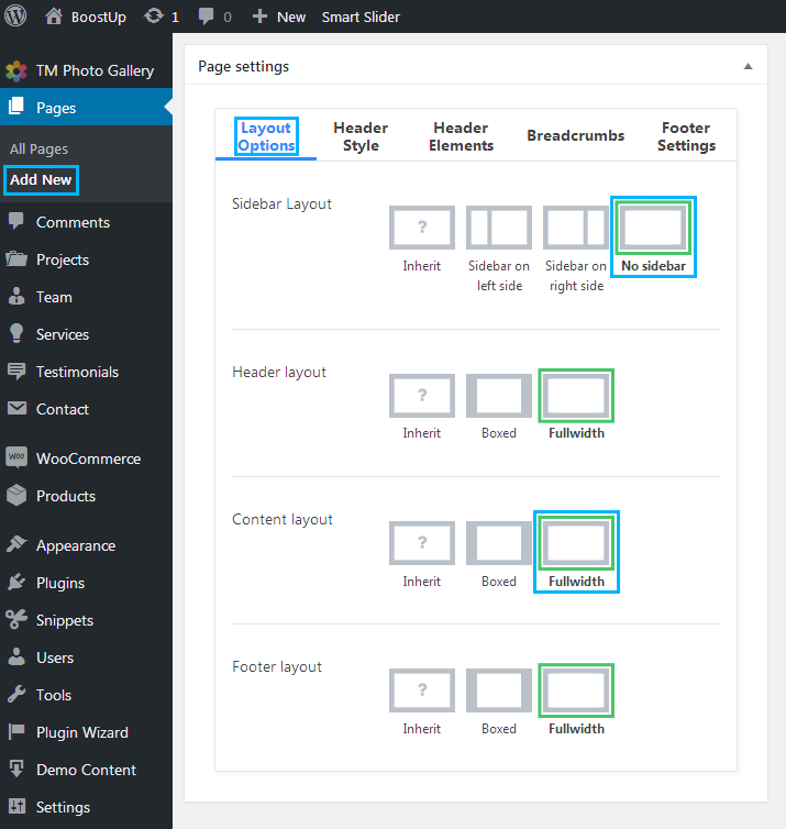
- Select No sidebar in Sidebar Layout and Fullwidth in Content Layout. You can find both options in Layout Options block.
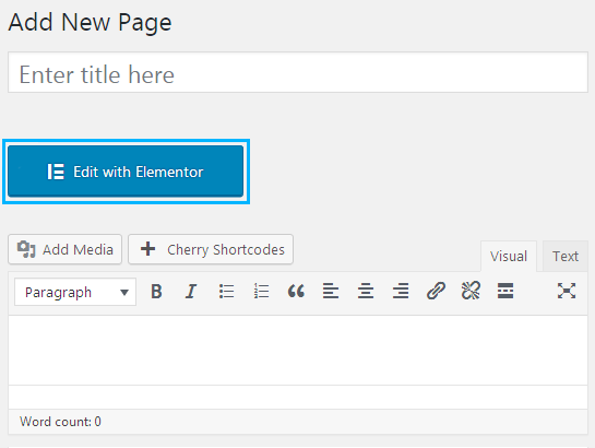
- Click Edit with Elementor button to proceed to editing with Elementor.
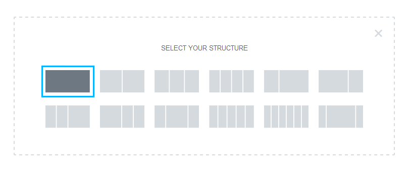
- Next, click Add a new section button to create a new section and select one column section layout from the section layouts block.

- Click Edit Section icon to open Edit Section block. Here switch to Style settings tab.

- Select Classic background type and upload an image to use it as a section background.
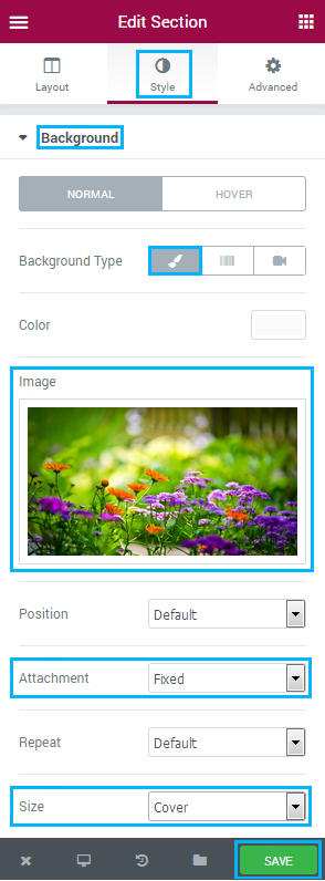
- Choose Fixed in the Attachment dropdown list.
- Specify Cover in the Size list.
- Let’s add some content to the section area. Drop any content modules you want to add to it (in our case, we added Heading module).
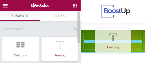
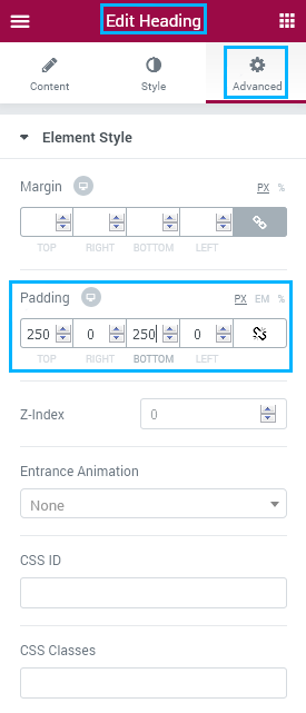
- To make the section height larger we added 250 px value to Top and Bottom Heading module padding in Advanced > Padding block.
 You can also use Spacer modules to increase the section height.
 - Click Save button in order to save the changes.
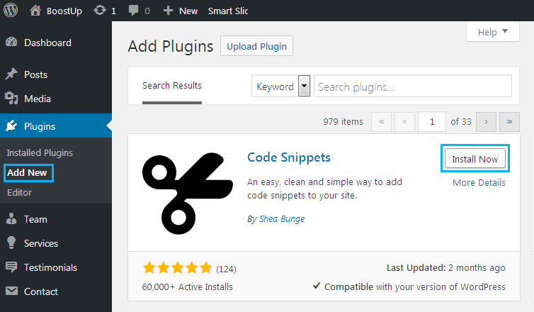
- Now let’s return to WordPress Dashboard. We need to add a code snippet, so you should install code snippet plugin first. Please, navigate to Plugins > Add new tab and search for Code Snippets plugin. Install and activate it.
- After you’ve activated Code Snippets plugin, you can see Snippets tab on the left of the Dashboard. Navigate to Snippets > Add new and paste the following code into the code area.
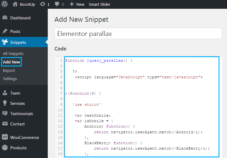
- Click Save the changes and activate button to make the code snippet work.

- Now let’s return to Elementor page builder. Open the page where you created the section with Elementor.
- Here click Edit Section icon and switch to Advanced settings tab.
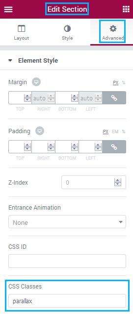
- In the CSS Classes field input parallax class.
- Save the changes. Now you can go to the page you’ve created to see the parallax effect in work!
Best Ways to Use Parallax Effects in 2020
Diverse Elementor Parallax background effects open an array of opportunities for websites’ owners. They look stunning on pages of different purpose and complexity. Get a hold of the most popular ways to implement Parallax in 2020!
Less Information More Intrigue
Often for a presentation of a product, service, or the whole company you just need a landing page. These pages are similar to each other, and the only way to stand out among competitors is to use some interesting design solutions. Parallax effects can be such a solution could be. With their help, you can animate illustrations and tex. As well, add depth to your WordPress website that will gain lots of impressed visitors. To see what is meant in reality, check the Dogstudio official page.

Highlight Objects with Parallax
Parallax is a great way to highlight one object leading it through the entire page. On the upper “layer”, which is illusory closest to the viewer, you need to place a key object. This will help to make an additional emphasis on it. Look at the Cyclemon site as an example of Elementor Parallax background.

Show Dynamics with Using Parallax
If you promote to sell a service, rely on Parallax. It’s the best option to show your offer in dynamics and describe the process. Parallax effects will easily create the illusion of movement. An example you can find visiting the Madebyshap Method page.

Making a Conclusion
So, in this article, we’ve discovered how to create an Elementor Parallax background. How can you imagine the process of website building without Parallax effects now? Agree, that Elementor Parallax background options push the limits and give you additional possibilities in running sites. If you are tired of tedious backgrounds then why not try the described above settings of your favorite Elementor plugin and make the illusion of deep screen. Hopefully, this tutorial helped you in generating brand-new ideas through the bizarre and attractive Elementor parallax effect.


