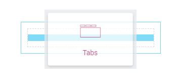
From this tutorial you will learn how to create engaging blocks using Tabs widget.
- Click Add New Section button, select the structure and drag and drop Tabs module.
- You will see default module layout, which can be customized. You can add new tabs, duplicate or delete the one you don’t need.
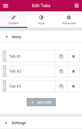
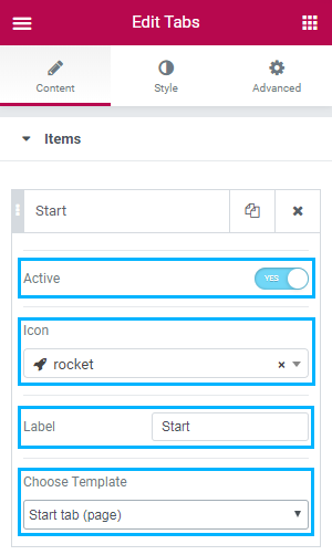
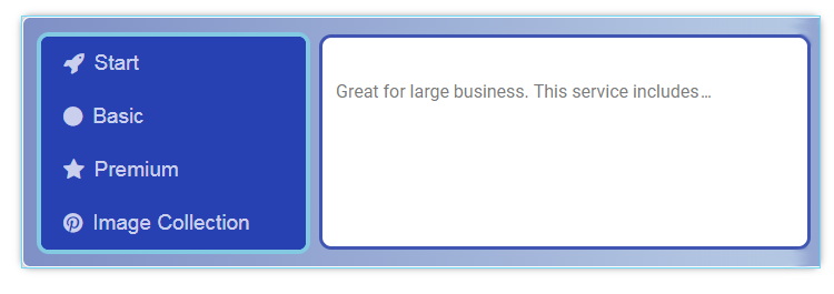
- Click Tab #1 to see entire list of settings. Here you can select Icon from the dropdown list, change tab name in Label field, set the tab as Active, and finally, select the template you created previously.
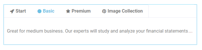
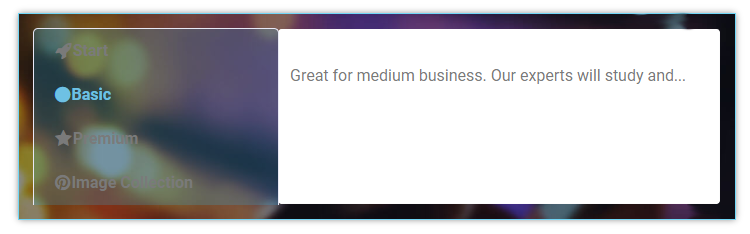
- Customize the rest of the items. Here’s what we’ve got on this stage.
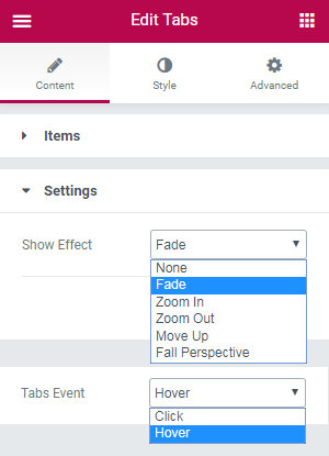
- Next, go to the Settings block and choose options form the list for Show Effect and Tabs Event. For this tutorial we selected Fade effect and Hover event.
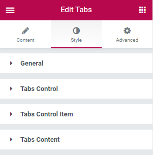
- Navigate to Style tab to change tabs layout.
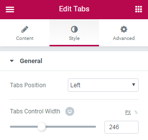
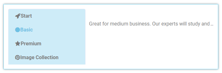
- Click on General block to access the full list of options. This block is responsible for setting up entire look of the widget. Tabs Position allows to select whether tabs will be displayed on the Top, Left or Right side. For this tutorial we selected Left option, and got new setting – Tabs Control Width. Move the slider to set the width. Here’s what we’ve got.
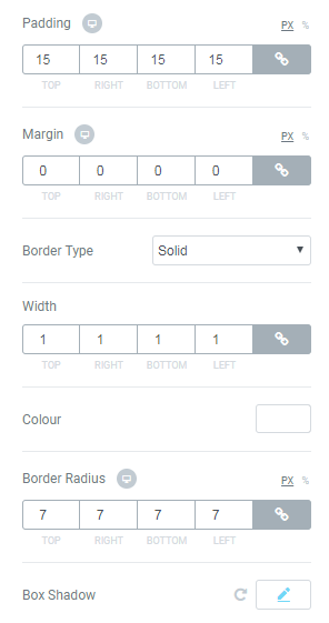
- The next options to be customized are Padding, Margin, Border Type, Width, Color, Border Radius and Box Shadow. Here you can try different settings to make better appearance of your widget. We set the following ones.
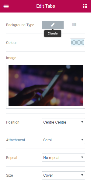
- Select Classic Type. Here you can select Color (e.g., rgba(110,193,228,0.25)) and/ or Image, which will be displayed behind the widget. Select its Position (we set Centre Centre), Attachment (we set Scroll), Repeat and Size options (we set No-repeat and Cover accordingly).
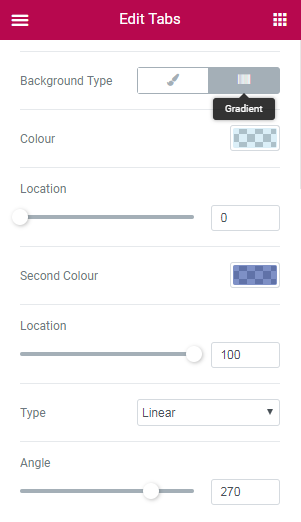
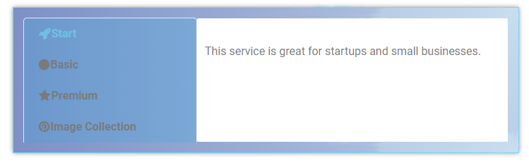
- Select Gradient Type. Here you need to select two colors in order to create a gradient effect. We set rgba (110,193,228,0.25) and rgba (8,42,145,0.52) accordingly. Also, you can move a slider to set colors location. Next, select Type (either Linear or Radial). Linear type has additional setting – Angle – move slider to set it. Radial type contains a dropdown list with alignment options. Here’s what we set and got.
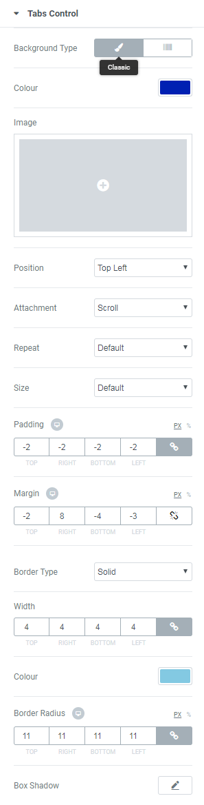
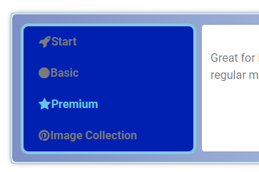
- Tabs Control block contains the same options as General block. Here you can change layout of Tabs Controls itself. Here’s the settings we selected and what we’ve got.
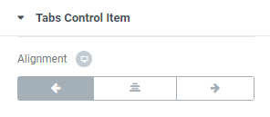
- Tabs Control Item block is responsible for what’s inside Tabs Controls. Change the Alignment of Tabs Controls content. We selected Left option.
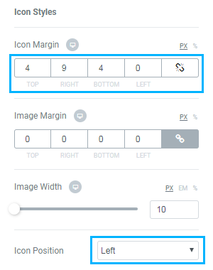
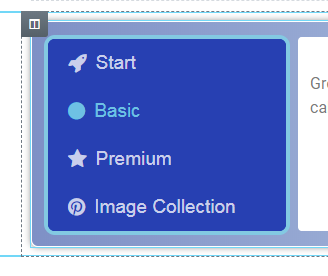
- On this step you can style up icons you selected previously. In this tutorial we changed Icon Margins and Icon Position. You are free to put any settings fitting you the best way.
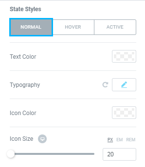
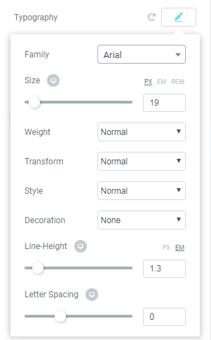
- In this block you can select your own Text Color (for example, rgba(255,255,255,0.75)), Typography options (see screenshot below), Icon Color (we used rgba(255,255,255,0.75)), Icon Size (e.g., 20).

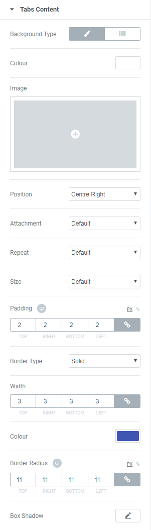
- Next, you can set up Background Type, select Image, change Paddings and Margins the same way as we did on the previous steps. Here’s the result after our changes’ done.
- This block allows to customize content layout. Here you will find the same options as in Tabs Control and Tabs Control Item blocks. Check the options we chose and see what we’ve got.
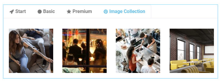
Tab with Image Gallery template looks the following way.
How to Customize General Block
How to Customize Tabs Background
There are two main variants of Background Type: Classic and Gradient.
How to Customize Tabs Control
How to Customize Icon Styles
How to Customize State Styles
Here you can switch between Normal, Hover or Active modes to customize the controls text and icon according to your needs when the tab is active, or in the normal state.
How to Customize Tabs Content
That’s all! Now you know how to work with Tabs widget in JetTabs plugin. Feel free to create the most winning layout!