
From this tutorial you’ll learn how to create your own Accordion widgets and style them up in the most suitable way.
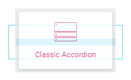
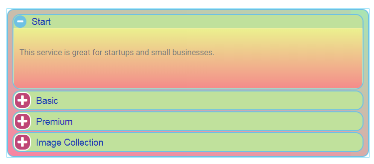
- Click Add New Section button, select the structure and drag and drop Classic Accordion module.
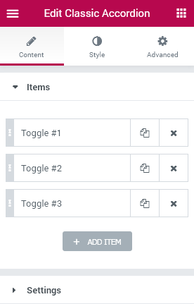
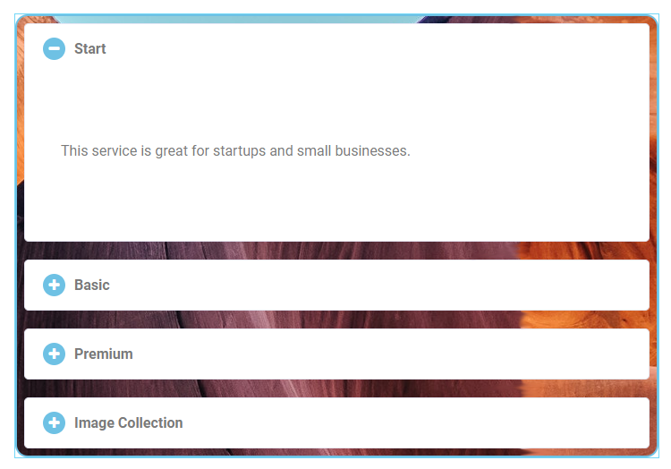
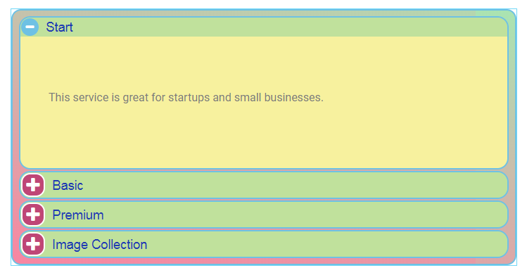
- You will see default module layout, which can be customized. You can add new tabs, duplicate or delete the one you don’t need
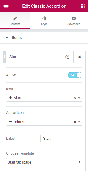
- Click Tab #1 to see entire list of settings. Here you can select Icon from the dropdown list, change tab name in Label field, set the tab as Active, and finally, select the template you created previously.
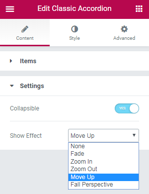
- Next, go to the Settings block and choose whether Accordion tabs are collapsible or not, and choose Show Effect.
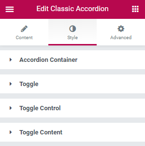
- Navigate to Style tab to change accordion tabs layout.
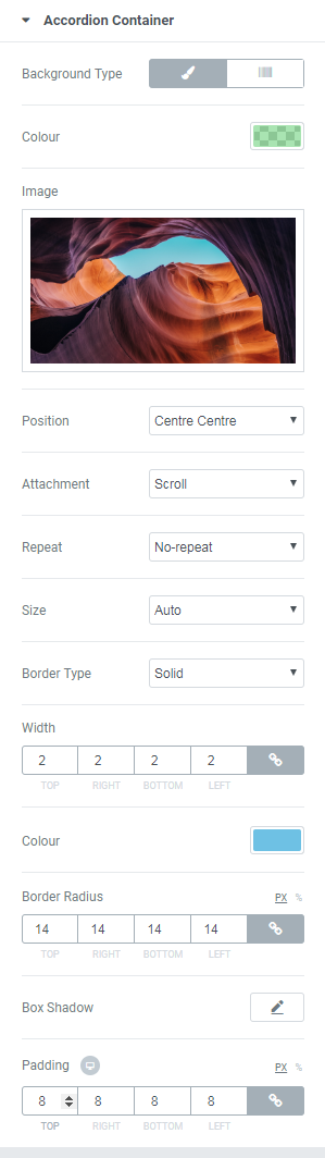
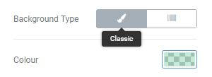
- Select Classic Type. Here you can select Color (e.g., rgba (97,206,112,0.54)) and/ or Image, which will be displayed behind the widget. Select its Position (we set Centre Centre), Attachment (we set Scroll), Repeat and Size options (we set No-repeat and Auto accordingly).
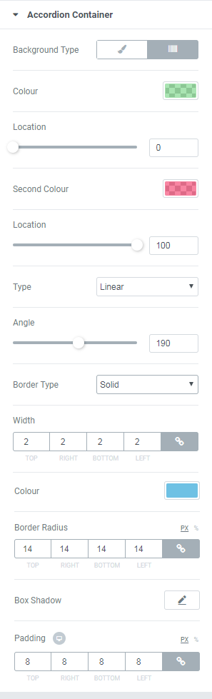
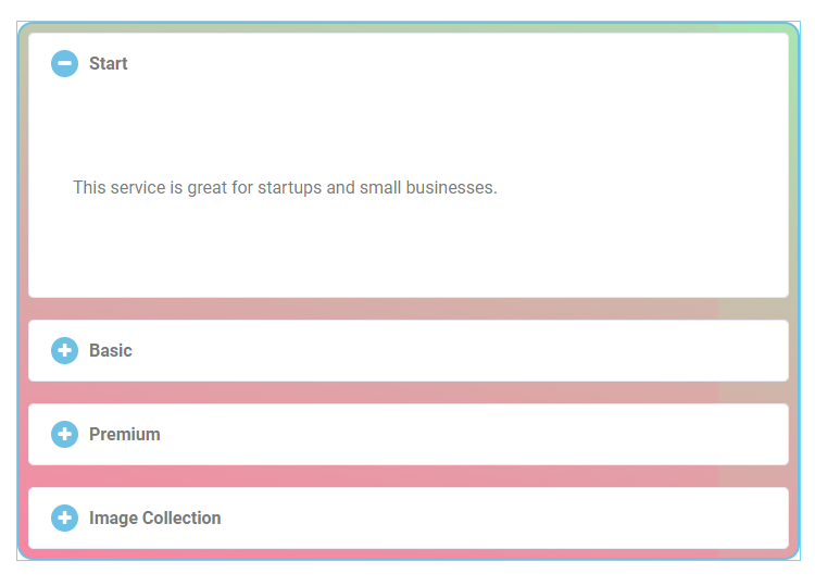
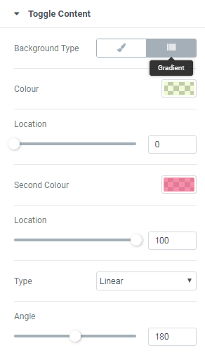
- Select Gradient Type. Here you need to select two colors in order to create a gradient effect. We set rgba (97,206,112,0.54) and rgba (242,41,91,0.57) accordingly. Also, you can move a slider to set colors location. Next, select Type (either Linear or Radial). Linear type has additional setting – Angle – move slider to set it. Radial type contains a dropdown list with alignment options. Here’s what we set and got.
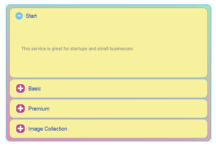
- This block can be customized the same way as Accordion Container one, e.g., you can set up Paddings and Margins, style up block Background Type, add Border and set it up as well. In our tutorial we worked with some options as here’s what we’ve got.
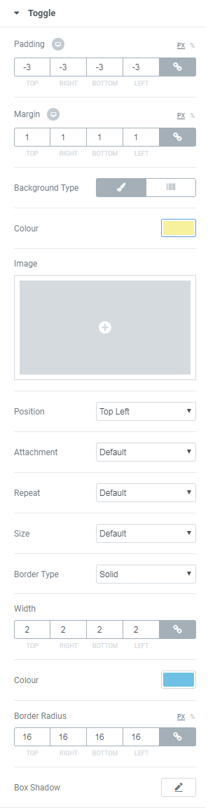
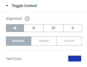
- This block is responsible for Toggle appearance customization. First, select the Alignment, and then – Text Color (e.g., #203ab2).Here you can switch between Normal, Hover or Active modes to customize the controls text and icon according to your needs when the tab is active, or in the normal state. .
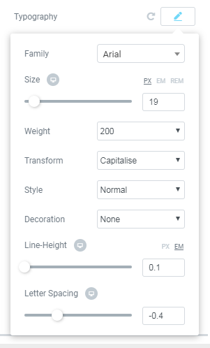
- Next, select Typography options suitable for your widget.
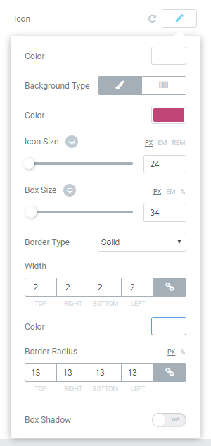
- On this step you can customize your Icon appearance. Note, that here you have two Background Type options: Classic and Gradient. In our tutorial we chose Classic type and selected color #bf4676. Also, we changed parameters of Icon and Box Size, set Border Type, its Width, Radius and Color (#ffffff). Here’s what we’ve got.
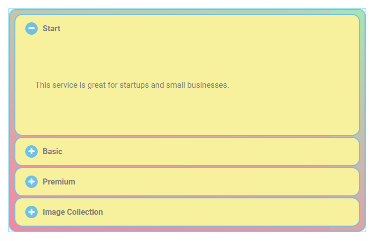
- The next setting allows to change Background Type and Color of the Toggle Control area. Just as in previous steps, you can select either Classic or Gradient Background Type and choose the best suitable options. For this tutorial we selected Color rgba (95,198,152,0.36), and you can check what we’ve got below.
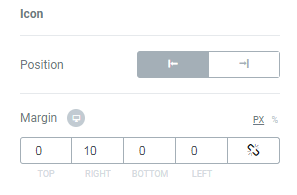
- Navigate below, where you’ll see Icon options – Position and Margin. Position parameter allows to set the icon on the left or on the right of the text.
- This block contains options for Content block customization. Here you will also find Background Type settings. This time we chose Gradient type and used colors rgba (195,237,90,0.23) and rgba (242,92,129,0.68) to style up our content area.
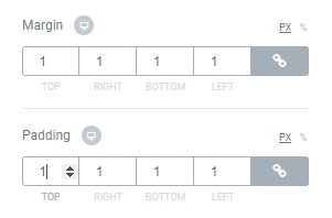
- Next, there are again Margin and Padding options. Make your changes suiting you the best.
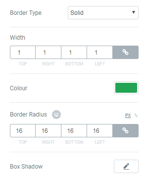
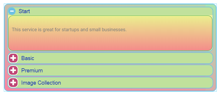
- On this step you can set Border Type to your Content Block if you want to. We selected Solid Type, set Border Width to 1, chose color #23a455 and set Border Radius to 16. Here’s what we’ve got.
How to Customize Accordion Container Block
Click on Accordion Container block to access the full list of options. This block is responsible for setting up entire look of the widget. Here you can customize widgets Background and set Paddings.
How to Customize Accordion Containers Background
There are two main variants of Background Type: Classic and Gradient.
How to Customize Toggle Block
How to Customize Toggle Control Block
How to Customize Toggle Content Block
That’s all! That’s how you can create and style up Accordion Tabs!