
From this tutorial you’ll learn how to utilize Countdown Timer JetElements module style for Elementor.

Style
Item Styles
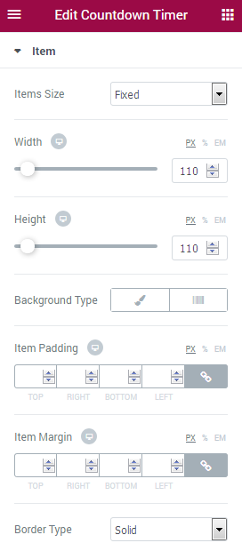
- Items Size — here you can select, if you want to use auto size, or you would rather use a fixed size for the items. If you choose the fixed width for the items, you’ll be able to set the width and height in pixels in the blocks below.
- Width — here you can select the width of the items.
- Height — here you can select the height of the items.
- Background Type — in this block you can choose, whether you want to use classic or gradient type for the background. The customization options vary for each type.
Classic Background Type
- Color — here you can set background color using color picker tool.
- Image — here you can choose the image you want to use as a background. Select the image from the media library or upload it to define it as a background in this block. When the image is uploaded, you’ll be able to define its position, alignment, turn on repeat and set the necessary size.
- Opacity — here you can define the value for the opacity of the background.
Gradient Background Type
- Color — here you can set background color using color picker tool.
- Location — here you can define the proportion for the first color in the gradient background.
- Second Color — here you can set the second color to use in the gradient background.
- Location — here you can define the proportion for the second color in the gradient background.
- Type — define, if you want to use a linear or radial type of the gradient.
- Angle — in this block you can set the angle for the gradient (in degrees).
- Opacity — here you can change background opacity, where 1 is 100% opacity, and 0 — is 0% opacity.
- Border Type — here you can define the type of the border you need to use.
- Box Shadow — enable this option if you want to access the shadow advanced settings for this module, and need to apply shadow for it.
Labels 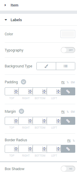
- Color — here you can define the suitable color for the countdown timer. Use color picker tool to select the necessary color.
- Typography — turn the option on to view the typography settings.
- Size — define the font size of the countdown timer text.
- Family — here you can set the font family for the countdown timer text.
- Weight — in this block you can select the suitable font weight.
- Transform — here you can choose from the dropdown menu, if you want the countdown timer text to be shown in uppercase, lowercase, capitalize or normal way.
- Style — in this block you can choose from the dropdown menu the style for the font. It can be normal, italic (the characters look similar to handwriting) and oblique (the characters are slightly inclined to the right).
- Line Height — in this field you can set the height of the countdown timer text line.
- Letter Spacing — here you can set the space between letters.
- Box Shadow — enable this option if you want to access the shadow advanced settings for this module, and need to apply shadow for it.
Digits 
In this block you can set your custom styles for the countdown timer digits. The style options are similar to the general style options.
Separator Styles 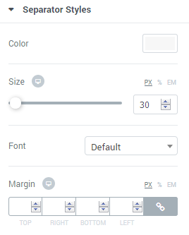
- Color — here you can select the suitable color for the separator (usually it is a colon between the digits).
- Size — in this block you can select the size of the separator in pixels.
- Font — in this block you can define the font in which the separator will be shown.
Order 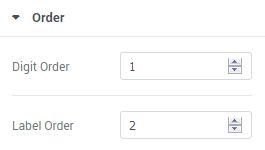
In this block you can set the custom order for the digits and labels.