From this tutorial you’ll learn how to customize Animated Box JetElements module style for Elementor.
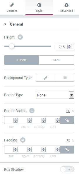
Style
General
Here you can switch from customizing Front to Back Animated Box settings. Just click on the button Back to proceed to customizing the back side of the Animated Box module elements.
- Height — here you can select the height value (in pixels) for the animated box module. The height is the general parameter for the front and back sides of the Animated Box.
- Background Type — in this block you can choose, whether you want to use classic or gradient type for the animated box background. The customization options vary for each type.
Classic Background Type
- Color — here you can set the background color for the animated box using color picker tool.
- Image — here you can choose the image you want to use as a background. Select the image from the media library or upload it to define it as a background in this block. When the image is uploaded, you’ll be able to define its position, alignment, turn on repeat and set the necessary size.
Gradient Background Type
- Color — here you can set the background color for the module using color picker tool.
- Location — here you can define the proportion for the first color in the gradient background.
- Second Color — here you can set the second color to use in the gradient background.
- Location — here you can define the proportion for the second color in the gradient background.
- Type — define, if you want to use a linear or radial type of the gradient.
- Angle — in this block you can set the angle for the gradient (in degrees).
- Border Type — here you can define the type of the border you need to use for the animated box.
- Box Shadow — enable this option if you want to access the shadow advanced settings for this module, and need to apply shadow for it. Shadow Settings:
- color — here you can set the color for the shadow (use color picker tool to do it);
- blur — in this block you can define the blur settings for the shadow;
- spread — here you can set how large the shadow will be;
- horizontal — here you can move the shadow horizontally (from right to left);
- vertical — here you can move the shadow vertically (from top to bottom).
Icon
Here you can switch to customizing Front and Back Icon. To switch to customizing them you need to click on the corresponding button. 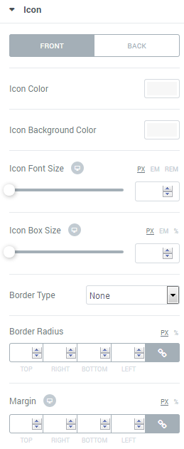
- Icon Color — here you can select the color to use it for the icon.
- Background Color — in this block you can set the color to use it in the icon background.
- Font Size — here you can define the value of icon size in pixels.
- Box Size — in this block you can input the value for icon box size (in pixels).
- Border Type — here you can select the type of the border from the dropdown menu. Here is the list of available border types:
- none;
- solid;
- doubled;
- dotted;
- dashed.
- Box Shadow — enable this option if you want to access the shadow advanced settings for this module, and need to apply shadow for it.
- Alignment — here you can define the preferable icon alignment. The icon can be placed to the left, to the right, or remain centered.
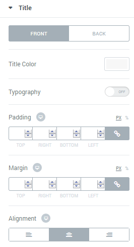
Title
- Title Color — here you can define the suitable color for the animated box title. Use color picker tool to select the necessary color.
- Typography — turn the option on to view the typography settings.
- Size — define the font size of the animated box title.
- Family — here you can set the font family for the title.
- Weight — in this block you can select the suitable font weight.
- Transform — here you can choose from the dropdown menu, if you want the title to be shown in uppercase, lowercase, capitalize or normal way.
- Style — in this block you can choose from the dropdown menu the style for the font. It can be normal, italic (the characters look similar to handwriting) and oblique (the characters are slightly inclined to the right).
- Line Height — in this field you can set the height of the title line.
- Letter Spacing — here you can set the space between letters.
- Alignment — here you can define the preferable title alignment. The title can be placed to the left, to the right, or remain centered.
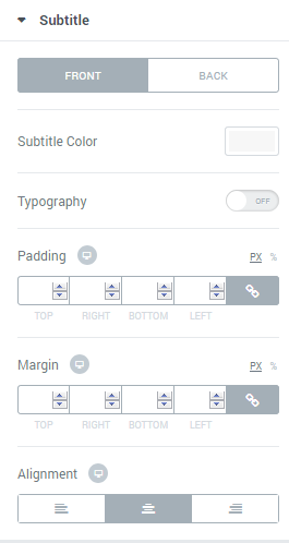
Subtitle
- Subtitle Color — here you can define the suitable color for the animated box subtitle. Use color picker tool to select the necessary color.
- Typography — turn the option on to view the typography settings.
- Size — define the font size of the animated box subtitle.
- Family — here you can set the font family for the subtitle.
- Weight — in this block you can select the suitable font weight.
- Transform — here you can choose from the dropdown menu, if you want the subtitle to be shown in uppercase, lowercase, capitalize or normal way.
- Style — in this block you can choose from the dropdown menu the style for the font. It can be normal, italic (the characters look similar to handwriting) and oblique (the characters are slightly inclined to the right).
- Line Height — in this field you can set the height of the subtitle line.
- Letter Spacing — here you can set the space between letters.
- Alignment — here you can define the preferable subtitle alignment. The title can be placed to the left, to the right, or remain centered.
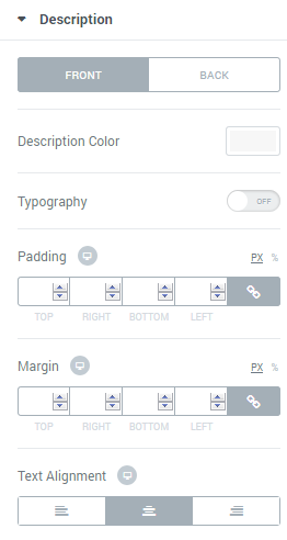
Description
Here you can switch from customizing Front to setting up Back Description. To do it click on the corresponding button.
- Description Color — here you can define the suitable color for the animated box content. Use color picker tool to select the necessary color.
- Typography — turn the option on to view the typography settings.
- Size — define the font size of the animated box content.
- Family — here you can set the font family for the content.
- Weight — in this block you can select the suitable font weight.
- Transform — here you can choose from the dropdown menu, if you want the content to be shown in uppercase, lowercase, capitalize or normal way.
- Style — in this block you can choose from the dropdown menu the style for the font. It can be normal, italic (the characters look similar to handwriting) and oblique (the characters are slightly inclined to the right).
- Line Height — in this field you can set the height of the content text lines.
- Letter Spacing — here you can set the space between letters.
- Alignment — here you can define the preferable content alignment. The title can be placed to the left, to the right, or remain centered.
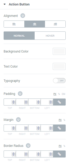
Action Button
Here you can switch from customizing Front to setting up Back of the Action Button. To do it click on the corresponding button.
- Background Color — here you can define the suitable color for the animated box button background. Use color picker tool to select the necessary color.
- Text Color — in this block you need to select the preferable color for the button text.
- Typography — turn the option on to view the typography settings. They are similar to Description Typography options.
- Border Type — here you can select the type of the border from the dropdown menu.
- Box Shadow — enable this option if you want to access the shadow advanced settings for this module, and need to apply shadow for it.
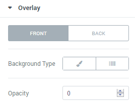
Overlay
- Background Type — in this block you can choose, whether you want to use classic or gradient type for the animated box background. The customization options vary for each type.
Classic Background Type
- Color — here you can set the background color for the animated box using color picker tool.
- Image — here you can choose the image you want to use as a background. Select the image from the media library or upload it to define it as a background in this block. When the image is uploaded, you’ll be able to define its position, alignment, turn on repeat and set the necessary size.
Gradient Background Type
- Color — here you can set background color for the module using color picker tool.
- Location — here you can define the proportion for the first color in the gradient background.
- Second Color — here you can set the second color to use in the gradient background.
- Location — here you can define the proportion for the second color in the gradient background.
- Type — define, if you want to use a linear or radial type of the gradient.
- Angle — in this block you can set the angle for the gradient (in degrees).
- Opacity — in this block you can choose the opacity for the overlay.
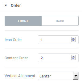
Order
In this block you can define the preferable order of elements displayed in the animated box. Input the order number for each of the elements in the required fields to create your custom elements order.