
From this tutorial you’ll learn how to utilize Slider JetElements module style for Elementor.
Style
In this block, you can change style and appearance settings for Slider module, define items padding, alignment, additional elements color, etc.
General 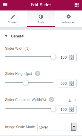
- Slider Width — here you can define the width of the slider in percents.
- Height — here you can specify the height of the slider in percents.
- Container Width — define the custom width of the slider container in percents.
- Image Scale Mode — here you can select if you want to use covered or contained image scale mode for the slider.
Overlay 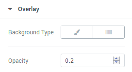
- Background Type — in this block you can choose, whether you want to use classic or gradient type for the module overlay. The customization options vary for each type.
Classic Background Type
- Color — here you can set the background color for the overlay using color picker tool.
- Image — here you can choose the image you want to use as a background. Select the image from the media library or upload it to define it as a background in this block. When the image is uploaded, you’ll be able to define its position, alignment, turn on repeat and set the necessary size.
- Opacity — here you can define the value for the opacity of the background.
Gradient Background Type
- Color — here you can set the background color for the overlay using color picker tool.
- Location — here you can define the proportion for the first color in the gradient background.
- Second Color — here you can set the second color to use in the gradient background.
- Location — here you can define the proportion for the second color in the gradient background.
- Type — define, if you want to use linear or radial type of the gradient.
- Angle — in this block you can set the angle for the gradient (in degrees).
- Opacity — here you can change background opacity, where 1 is 100% opacity, and 0 — is 0% opacity.
Navigation 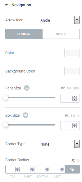
- Arrow Icon — here you can set the specific arrow icon for the navigation controls.
- angle;
- chevron;
- angle double;
- arrow;
- caret;
- long arrow;
- arrow circle;
- chevron circle;
- caret square;
- Color — here you can set the color of the module navigation elements using color picker tool.
- Background Color — here you can set the background color of the module navigation elements using color picker tool.
- Font Size — in this block you can specify the font size of the navigation elements.
- Box Size — here you can define the preferable size of the navigation box.
- Border Type — here you can define the needed border type for the module navigation elements. It can be dotted, dashed, double or solid.
- Border Radius — define the necessary border radius values in the required fields.
- Box Shadow — enable this option if you want to access the shadow advanced settings for this module navigation elements, and need to apply shadow for them.
Pagination 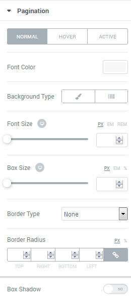
You can customize the appearance of pagination elements in the Normal, Hover or Active mode. Just switch between the modes using the corresponding buttons.
- Font Color — here you can set the font color of the module pagination using color picker tool.
- Background Type — in this block you can choose, whether you want to use classic or gradient type for the module pagination. The customization options vary for each type. The settings are similar to the common background type settings for other JetElements modules.
- Font Size — in this block you can specify the font size of the module pagination elements.
- Box Size — here you can define the preferable size of the pagination elements box.
- Border Type — here you can define the needed border type for the module pagination elements. It can be dotted, dashed, double or solid.
- Border Radius — define the necessary border radius values in the required fields.
- Box Shadow — enable this option if you want to access the shadow advanced settings for this module pagination elements, and need to apply shadow for them.
- Margin — input the values for the pagination elements margin in the required fields.
- Alignment — here you can set the pagination elements alignment (it can be centered, left or right).
- Pagination Container Offset — in this field you can define the preferable offset value for pagination elements using arrow controls.
Thumbnails 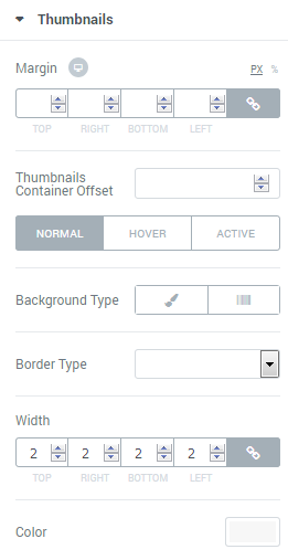
- Margin — input the values for the thumbnails margins in the required fields.
- Thumbnails Container Offset — in this field you can define the preferable offset value for thumbnails using arrow controls.
You can customize the appearance of Slider module thumbnails in the Normal, Hover or Active mode. Just switch between the modes using the corresponding buttons.
- Background Type — in this block you can choose, whether you want to use classic or gradient type for the module thumbnails. The customization options vary for each type. The settings are similar to the common background type settings for other JetElements modules.
- Border Type — here you can define the needed border type for the module thumbnails. It can be dotted, dashed, double or solid.
- Width — set the necessary width values in the required fields (top, right, bottom and left).
- Color — here you can define the preferable color using color picker tool.
Fullscreen 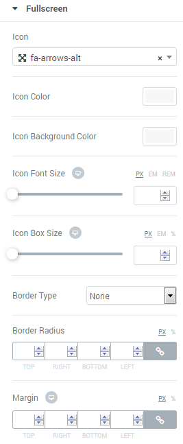
- Icon — here you can set the icon for the fullscreen mode.
- Color — in this block you can set the Fullscreen icon color using color picker tool.
- Background Color — here you can define the background color to show under the fullscreen icon.
- Font Size — paste the value for the fullscreen icon size.
- Box Size — input the value for the fullscreen icon box size.
- Border Type — here you can define the needed border type for the fullscreen icon. It can be dotted, dashed, double or solid.
- Border Radius — here you can define the values for the radius of the selected border.
- Margin — input the values for the fullscreen icon margins in the required fields.
- Box Shadow — enable this option if you want to access the shadow advanced settings for this fullscreen icon, and need to apply shadow for it.
Icon 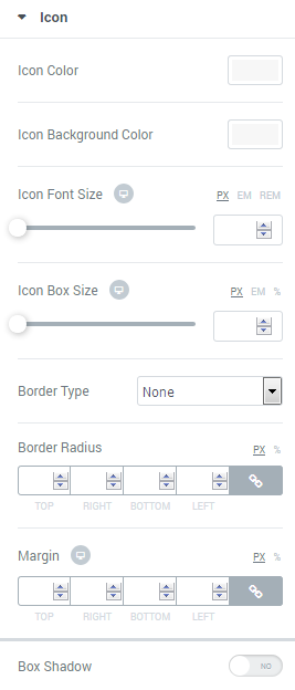
- Icon Color — in this block you can set the module icon color using color picker tool.
- Background Color — here you can define the background color to show under the icon.
- Font Size — paste the value for the icon size.
- Box Size — input the value for the icon box size.
- Border Type — here you can define the needed border type for the icon. It can be dotted, dashed, double or solid.
- Border Radius — here you can define the values for the radius of the selected border.
- Margin — input the values for the icon margins in the required fields.
- Box Shadow — enable this option if you want to access the shadow advanced settings for this icon, and need to apply shadow for it.
- Alignment — here you can set the icon alignment (it can be centered, left or right).
Title 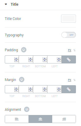
- Title Color — in this block you can set the color of the module title using color picker tool.
- Typography — turn the option on to view the typography settings. They are similar to the typography settings of other JetElements modules.
- Padding — here you can set the preferable custom padding for the title. Fill in the values for the top, bottom, right and left padding in pixels to apply your custom padding.
- Margin — input the values for the title margins in the required fields.
- Alignment — set the centered, left or right alignment for the title.
Subtitle 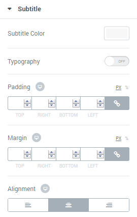
- Subtitle Color — in this block you can set the color of the module subtitle using color picker tool.
- Typography — turn the option on to view the typography settings. They are similar to the typography settings of other JetElements modules.
- Padding — here you can set the preferable custom padding for the subtitle. Fill in the values for the top, bottom, right and left padding in pixels to apply your custom padding.
- Margin — input the values for the subtitle margins in the required fields.
- Alignment — set the centered, left or right alignment for the subtitle.
Description 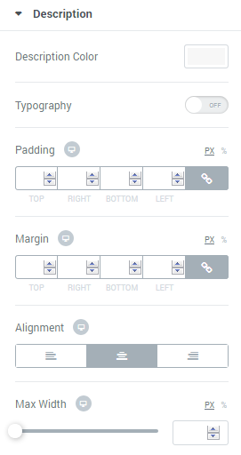
- Description Color — in this block you can set the color of the module description text using color picker tool.
- Typography — turn the option on to view the typography settings. They are similar to the typography settings of other JetElements modules.
- Padding — here you can set the preferable custom padding for the slider description. Fill in the values for the top, bottom, right and left padding in pixels to apply your custom padding.
- Margin — input the values for the description text margins in the required fields.
- Alignment — set the centered, left or right alignment for the description text.
- Max Width — here you can define the maximum width of the description text.
Action Button 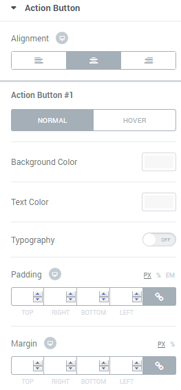
In this block you can customize the appearance settings of the first and the second action buttons. To navigate to the second action button appearance settings scroll the customization options block down.
- Alignment — set the centered, left or right alignment for the module action button.
You can customize the appearance of Slider module thumbnails using Normal or Hover mode. Just switch between the modes using the corresponding buttons.
- Background Color — in this block you can set the background color of the module action button using color picker tool.
- Text Color — in this block you can set the text color of the module action button using color picker tool.
- Typography — turn the option on to view the typography settings. They are similar to the typography settings of other JetElements modules.
- Padding — here you can set the preferable custom padding for the slider action button. Fill in the values for the top, bottom, right and left padding in pixels to apply your custom padding.
- Margin — input the values for the action button margins in the required fields.
- Border Type — here you can define the needed border type for the action button. It can be dotted, dashed, double or solid.
- Border Radius — here you can define the values for the radius of the selected border.
- Box Shadow — enable this option if you want to access the shadow advanced settings for this action button, and need to apply shadow for it.