Become a pro at showcasing your company’s services with the help of Services module. It affords you to visually improve the general looks of the services block by adding columns, defining categories of posts to show, hiding the specific categories, and, of course, you can use a More button to display only the text passage instead of the whole post’s content.
Power Builder Services Module Settings
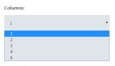
- Columns — here you can define the number of columns, in which the services will be showcased.
- Include post ID — here you can define the ID of the specific post to be shown in the Services module. Thus you can define the posts to be shown not only using categories, but using IDs. If you don’t know where to get your post ID, feel free to read How to Find Out Page/Post ID tutorial.

- Posts count — here you can set the number of posts to show in the module. Otherwise, you can leave the default count to show all the posts.

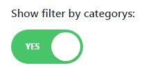
- Show filter by categories — enable an option to display the filter by categories. In this case, the services posts could be filtered by categories.
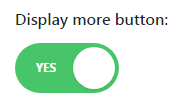
- Display More button — enable an option to activate More button for every post.
- More Button text — define the text that will be used as a More button title. You can otherwise leave the field blank to leave the default title of the button.

- Featured Image Size — here you can set the preferable image size for the featured images.

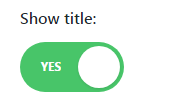
- Show title — enable an option to display the title.
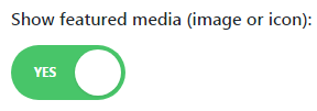
- Show featured media — here you can choose if you need to show the featured images or icons for the services. You can also disable this option to hide the featured images.
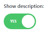
- Show description — enable the option if you need to show the services description.
- Description length — if you’ve enabled Show Description option, you’ll be able to set the length of the description. You can also leave the default length to hide the excerpt completely.

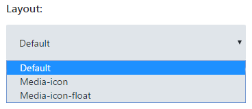
- Layout — choose the preferable layout for the services posts.
- Use gutter between columns — enable the option to create the flexible spacing between columns. Thus it will adjust to different screen resolutions.
- Use gutter between rows — enable the option to create the flexible spacing between rows.
This tutorial is based on Movie Responsive WordPress theme.


