From this tutorial you’ll learn how to utilize Pricing Table JetElements module style for Elementor.
Style
Table 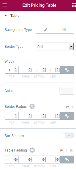
Here you can customize the pricing table style.
- Background Type — in this block you can choose, whether you want to use classic or gradient type for the pricing table background. The customization options vary for each type.
Classic Background Type
- Color — here you can set the background color for the animated box using color picker tool.
- Image — here you can choose the image you want to use as a background. Select the image from the media library or upload it to define it as a background in this block. When the image is uploaded, you’ll be able to define its position, alignment, turn on repeat and set the necessary size.
Gradient Background Type
- Color — here you can set the background color for the module using color picker tool.
- Location — here you can define the proportion for the first color in the gradient background.
- Second Color — here you can set the second color to use in the gradient background.
- Location — here you can define the proportion for the second color in the gradient background.
- Type — define, if you want to use a linear or radial type of the gradient.
- Angle — in this block you can set the angle for the gradient (in degrees).
- Border Type — here you can define the type of the border you need to use for the element.
- Box Shadow — enable this option if you want to access the shadow advanced settings for this module, and need to apply shadow for it.
Header 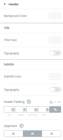
In this block you can apply custom colors and typography settings to the pricing table header.
- Background Color — here you can define the suitable color for the header background. Use color picker tool to select the necessary color.
- Title Color — here you can define the suitable color for the header title. Use color picker tool to select the necessary color.
- Subtitle Color — here you can define the suitable color for the header subtitle. Use color picker tool to select the necessary color.
- Typography — turn the option on to view the typography settings. The typography settings are similar for Title, Subtitle, Pricing, Features, Action Box and Action Button blocks.
- Size — define the font size of the animated box title.
- Family — here you can set the font family for the title.
- Weight — in this block you can select the suitable font weight.
- Transform — here you can choose from the dropdown menu, if you want the title to be shown in uppercase, lowercase, capitalize or normal way.
- Style — in this block you can choose from the dropdown menu the style for the font. It can be normal, italic (the characters look similar to handwriting) and oblique (the characters are slightly inclined to the right).
- Line Height — in this field you can set the height of the title line.
- Letter Spacing — here you can set the space between letters.
- Border Type — here you can define the type of the border you need to use for the element.
- Alignment — here you can define the preferable title alignment. The title can be placed to the left, to the right, or remain centered.
Icon 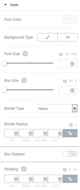
Here you can customize Icon color, font size, box size and icon background color.
- Font Color — here you can set icon font color for the module using color picker tool.
- Background Type — in this block you can choose, whether you want to use classic or gradient type for the pricing table background. The customization options vary for each type.
Classic Background Type
- Color — here you can set the background color for the animated box using color picker tool.
Gradient Background Type
- Color — here you can set the background color for the module using color picker tool.
- Location — here you can define the proportion for the first color in the gradient background.
- Second Color — here you can set the second color to use in the gradient background.
- Location — here you can define the proportion for the second color in the gradient background.
- Type — define, if you want to use a linear or radial type of the gradient.
- Angle — in this block you can set the angle for the gradient (in degrees).
- Icon Font Size — in this block you can define the size of the icon digit (the maximum size is 200 px).
- Box Size — in this block you can define the size of the icon box (the maximum size is 200 px).
- Border Type — here you can define the type of the border you need to use for the icon.
- Box Shadow — enable this option if you want to access the shadow advanced settings for the icon, and need to apply shadow for it.
- Alignment — here you can define the preferable alignment. The element can be placed to the left, to the right, or remain centered.
Pricing 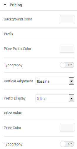
In this block you can apply custom appearance settings to the pricing background, prefix, values and suffix typography, and colors.
- Background Color — here you can select the color to use it for the pricing general background.
- Price Prefix Color — here you can select the preferable color for the price prefix.
- Suffix Color — here you need to specify the color of the price suffix.
- Price Color — in this block you can define the color to use for the price.
- Typography — turn the option on to view the typography settings. The typography settings are similar for Title, Subtitle, Pricing, Features, Action Box and Action Button blocks.
- Vertical Alignment — here you can define the specifics of the prefix vertical alignment.
- Prefix Display — here you can define if you want the prefix to be displayed inline, or as a separate block.
- Suffix Display — here you can define if you want the suffix to be displayed inline, or as a separate block.
- Border Type — here you can define the type of the border you need to use for the element.
- Alignment — here you can define the preferable alignment. The element can be placed to the left, to the right, or remain centered.
Features 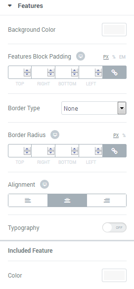
In this block you can customize pricing table features, such as features background color and alignment.
- Background Color — here you can define the background color to use it in the features background.
- Alignment — here you can define the preferable features alignment. The features can be placed to the left, to the right, or remain centered.
- Typography — turn the option on to view the typography settings. The typography settings are similar for Title, Subtitle, Pricing, Features, Action Box and Action Button blocks.
- Included (Excluded) Feature Color — here you can specify the color for the excluded and included features.
- Included Bullet Icon — here you can define the icon to use for the included features.
- Excluded Bullet Icon — here you can select the icon you want to use for the excluded features.
- Text Decoration — for the excluded features you can enable such text decoration element, as a line through.
- Bullet Color — here you can select the color you want to use for the included or excluded features icons.
- Icon Size — here you can define the size of the excluded of included features icons.
- Features Divider — enable the option if you want to separate features using a divider to make them stand out.
- Divider Style — here you can select the style to use for the divider. It can be solid, double, dotted or dashed.
You can also define the weight, the width and the gap for the divider using the corresponding controls.
Action Box 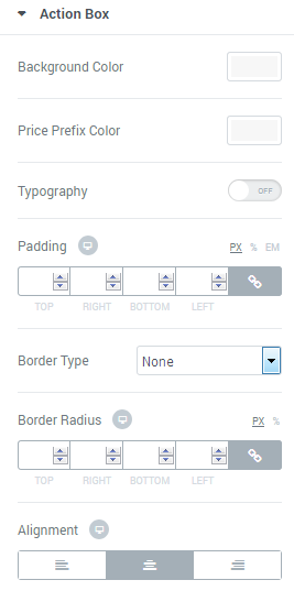
In this block you can customize the Action Box elements, such as action box background, typography, etc.
- Background Color — click on the option to define the suitable color for Action box background.
- Price Prefix Color — here you can set the color to use it for the price prefix in the Action Box.
- Typography — turn the option on to view the typography settings. The typography settings are similar for Title, Subtitle, Pricing, Features, Action Box and Action Button blocks.
- Border Type — here you can define the type of the border you need to use for the element.
- Alignment — here you can define the preferable action box alignment. The content of the Action Box can be placed to the left, to the right, or remain centered.
Action Button 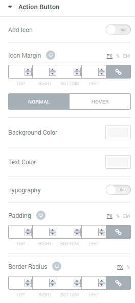
In this block you can apply custom appearance settings for the button background, button text, change text typography, etc.
You can switch from customizing Normal to Hover style settings. Just click on the button Hover to proceed to customizing hover elements.
- Background Color — here you can select the suitable background for the Action button.
- Text Color — use color picker tool to set the preferable color for the button text.
- Typography — turn the option on to view the typography settings. The typography settings are similar for Title, Subtitle, Pricing, Features, Action Box and Action Button blocks.
- Border Type — here you can define the type of the border you need to use for the element.
- Box Shadow — enable this option if you want to access the shadow advanced settings for this module, and need to apply shadow for it.