From this tutorial you’ll learn how to style up Review widget.
- After you created and customized your Reviews widget you are ready to change its style settings to create your own layout. Navigate to Style tab and find the following blocks:
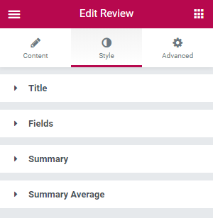
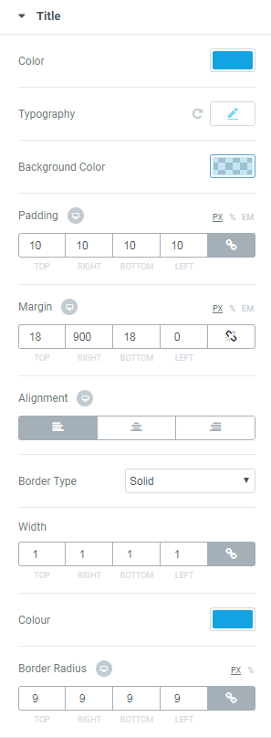
- Click on Title block. Here you are able to change title Color (e.g., #12a4e2), Background Color (rgba(110,193,228,0.4)), set Padding and Margin parameters, select title Alignment. Also, you can add Border if you want to, and set its Width, Color and Radius.
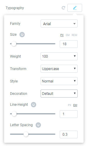
- Click on Typography editing icon and set the values you need.
- Now, click on Fields block. Here you will be able to change field with review values depending on layout type selected before. Let’s look at each of them closer.
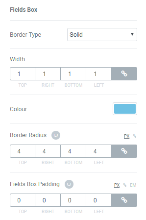
- Fields Box allows to style up widget’s area with review featured labels. You can add Border here and select the most suitable options.
- Here you can change Color and Typography of review featured labels.
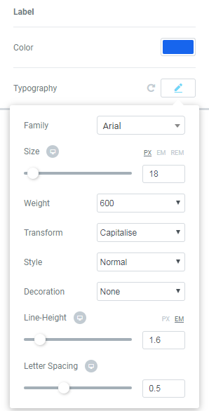
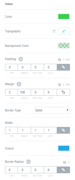
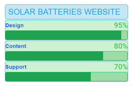
- This option works in the case you selected Points or Percentage option in Content tab > Field Settings > Layout. Here you can style up your value parameter: select its Color, Typography, Background Color, change Padding and Margin settings, add Border and style it up.
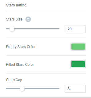
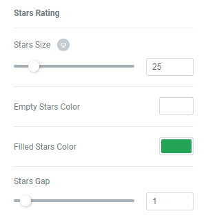
- If you selected widget’s review layout as Stars in Content tab, you need to use this block to style up. Here you can set stars size by moving slider or inputting numeric value, select Filled and Empty Stars Color, and set Gap between stars.
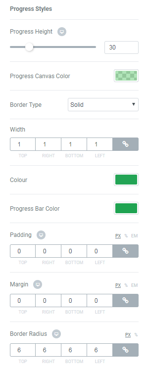
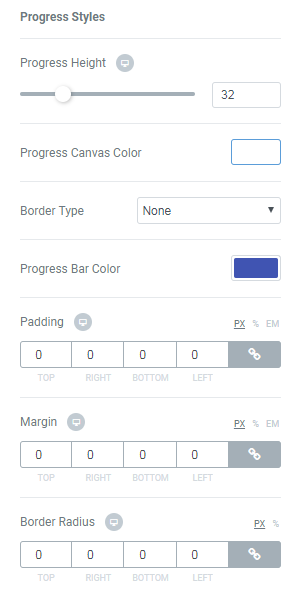
- If you selected Points or Percentage option in Content tab you are now able to style up progress bar appearance. Select Height, set Colors, add Border and change Padding and Margin parameters if needed.
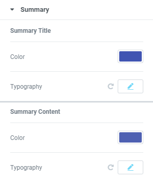
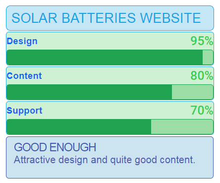
- Click on Summary block and locate fields available for customization.
- Here you can select Color and Typography options.
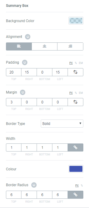
- On this step you need to select Background Color, Alignment, Padding and Margin parameters, add Border if you need.
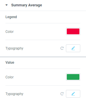
- Click on Summary Average block and locate fields available for customization.
- Here you can select Color and Typography options
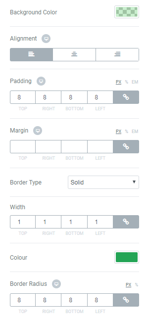
- Here you can set Background Color, Alignment, select Padding and Margin parameters, add Border if you need.
- If you selected Stars to be displayed in Summary Average field, you can customize them is this block. Change Stars Size by moving slider or setting numeric value, select Colors for Empty and Filled Stars, change Gap between them.
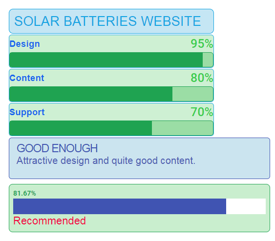
- If you enabled Progress Style option in Content tab > Summary Settings block, you’ll have options to style it up active. here you can set Progress Height, add Progress Canvas Color and Progress Bar Color, set Padding and Margin parameters and add Border if needed.
Here’s what how the Title of our Review widget looks on this stage. 
Fields Box Customization
Label
Value
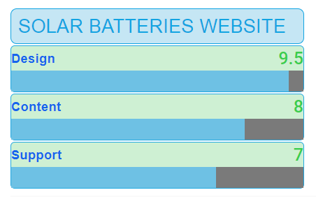
Here’s what we’ve got.
Stars Rating
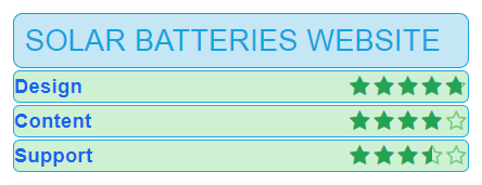
Here’s what we’ve got.
Progress Styles
Here’s what we’ve got.
Summary Box Customization
Summary Title and Summary Content
Summary Box
Here’s what we’ve got.
Summary Average Box Customization
Legend and Value
Stars Rating
Progress Styles
Finally, here’s what we’ve got!
Congrats! Now you know how to style up JetReviews widget and you are able to create your own astonishing widgets!


