
From this tutorial you’ll learn how to utilize Download Button JetElements module style for Elementor.
Style
In this block, you can change style and appearance settings for Download Button module, define item padding, alignment, additional elements color, etc.
Button 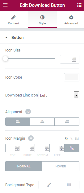
- Icon Size — here you can set the necessary icon size to use it for the button.
- Icon Color — use color picker tool to choose the needed icon color.
- Download Link Icon — use the dropdown menu to specify the position of the download link.
- Alignment — select the centered, left or right alignment of the button.
- Icon Margin — here you can define the preferable margin values for the button icon.
- Background Type — in this block you can choose, whether you want to use classic or gradient type for the button. The customization options vary for each type.
Classic Background Type
- Color — here you can set background color for the button using color picker tool.
- Image — here you can choose the image you want to use as a background. Select the image from the media library or upload it to define it as a background in this block. When the image is uploaded, you’ll be able to define its position, alignment, turn on repeat and set the necessary size.
- Opacity — here you can define the value for the opacity of the background.
Gradient Background Type
- Color — here you can set background color for the button using color picker tool.
- Location — here you can define the proportion for the first color in the gradient background.
- Second Color — here you can set the second color to use in the gradient background.
- Location — here you can define the proportion for the second color in the gradient background.
- Type — define, if you want to use linear or radial type of the gradient.
- Angle — in this block you can set the angle for the gradient (in degrees).
- Opacity — here you can change background opacity, where 1 is 100% opacity, and 0 — is 0% opacity.
Button Label 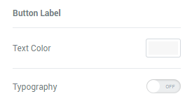
- Text Color — here you can select the preferable color of the button label text using color picker.
- Typography — turn the option on to view the typography settings.
- Size — define the font size of the button label.
- Family — here you can set the font family for the button label.
- Weight — in this block you can select the suitable font weight.
- Transform — here you can choose from the dropdown menu, if you want the text to be shown in uppercase, lowercase, capitalize or normal way.
- Style — in this block you can choose from the dropdown menu the style of the font. It can be normal, italic (the characters look similar to handwriting) and oblique (the characters are slightly inclined to the right).
- Line Height — in this field you can set the height of the text line.
- Letter Spacing — here you can set the space between letters.
Button Sub Label 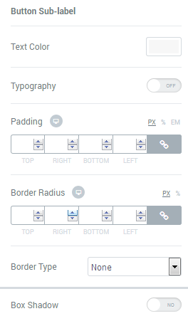
- Text Color — here you can select the preferable color of the button sub label text using color picker.
- Typography — turn the option on to view the typography settings. They are similar to those in the Button Label block.
- Padding — here you can set the preferable custom padding for the whole column where the module is displayed. Fill in the values for the top, bottom, right and left padding in pixels to apply your custom padding.