
From this tutorial you’ll learn how to utilize Circle Progress JetElements module style for Elementor.

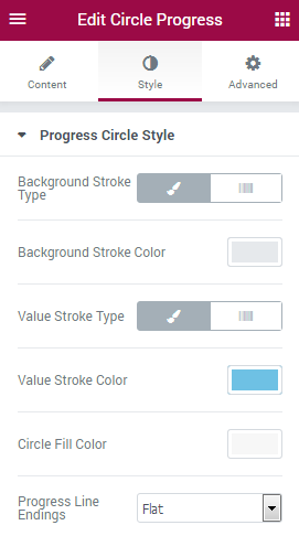
Style
- Background Stroke Type — here you can define the type of the stroke to use for the background outlines of the circle progress bar. It can be Classic or Gradient. Choose the one that is more suitable for you.
Classic Stroke Type
- Background Stroke Color — here you can define the color to use for the background outlines of the circle progress bar.
Gradient Stroke Type
- Background Stroke Color A — here you can define the first color to use for the background outlines of the circle progress bar.
- Stroke Color B — here you can define the second color to use for the background outlines of the circle progress bar.
- Gradient Angle — here you can define the angle between first and second gradients.
Value Classic Stroke Color
- Stroke Color — here you need to specify the color for the outlines of the completed progress.
Value Gradient Stroke Color
- Value Stroke Color A — here you can define the first color to use for the outlines of the circle progress bar.
- Color B — here you can define the second color to use for the outlines of the circle progress bar.
- Gradient Angle — here you can define the angle between first and second gradients.
- Circle Fill Color — here you need to specify the color that will be shown inside of the circle progress bar.
- Progress Line Endings — here you need to define, if you want the progress stroke line endings to be sharp or rounded, more smooth.
Content Style 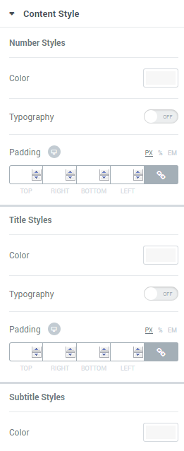
In this block you can define the style for these elements:
- number;
- title;
- subtitle.
Style settings for these three blocks are similar.
- Color — here you can define the suitable color for the Circle Progress module elements. Use color picker tool to select the necessary color.
- Typography — turn the option on to view the typography settings.
- Size — define the font size of the Circle Progress module element.
- Family — here you can set the font family for the Circle Progress module element.
- Weight — in this block you can select the suitable font weight.
- Transform — here you can choose from the dropdown menu, if you want the Circle Progress module element to be shown in uppercase, lowercase, capitalize or normal way.
- Style — in this block you can choose from the dropdown menu the style for the font. It can be normal, italic (the characters look similar to handwriting) and oblique (the characters are slightly inclined to the right).
- Line Height — in this field you can set the height of the Circle Progress module element lines.
- Letter Spacing — here you can set the space between letters.