From this tutorial you’ll learn how to manage Smart Slider 3 appearance settings, such as controls, thumbnails, text bars, etc.
To access the controls and text bar settings you need to navigate to Smart Slider tab on the left of the Dashboard. Here scroll the page down to see all the available settings, including the ones mentioned above. 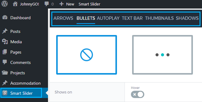
Arrows 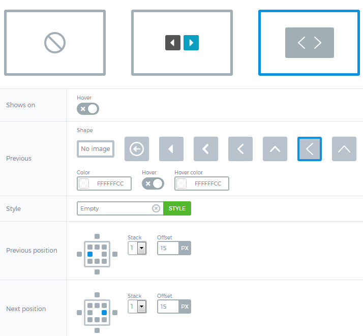
- Arrow types – here you can select the type of arrows to use it for the slider.
- Shows on – enable showing arrows on hover.
- Previous – here you can select the arrow icon, or disable it. You can also set the color of the arrow and set the color to be used on hover.
- Style – from here you can navigate to Style Manager, where you can change the arrow style (its background color, opacity, padding, border, change border color and type, use box shadow, etc.).
- Previous position – here you can specify the Previous arrow position.
- Next position – here you can set the Next arrow position.
Bullets 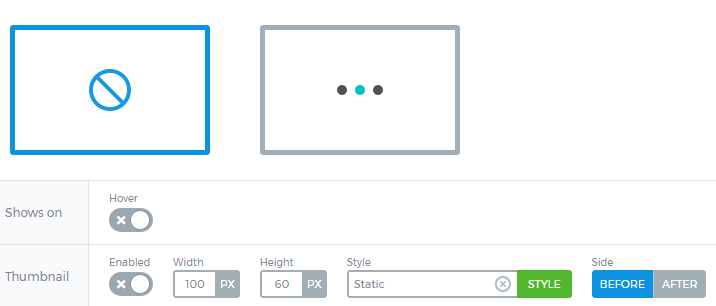
- Bullets – here you can disable or enable bullet controls (pagination dots).
- Shows on – enable this option to show pagination dots on hover.
- Thumbnail – enable this option to use thumbnail.
Autoplay 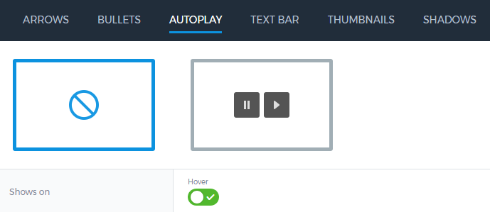
- Autoplay on-off – here you can enable or disable autoplay.
- Shows on – enable this option to use autoplay on hover.
Text Bar 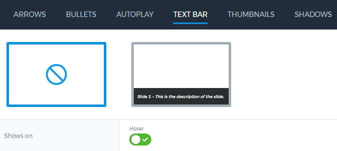
- On- off – here you can enable or disable the text bar.
- Shows on – enable this option to show the text bar on hover.
Thumbnails 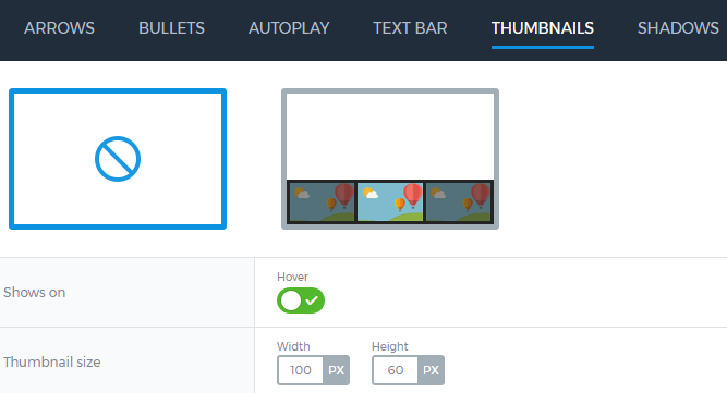
- On-off – here you can enable or disable the thumbnail images.
- Shows on – enable this option to show the thumbnails on hover.
- Thumbnail size – here you can specify the thumbnail height and width.
Shadows 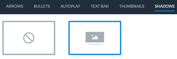
- On-off – here you can enable or disable the shadows option for the slider.
- When the previous option is enabled, you can choose the shadow to apply to the slider.
After everything is set, click Save button to save the changes. Now you can open Publish tab and add the slider to your website’s page.


