Here you can find the instructions on how to manage Featured Products widget.
1. Navigate to Content > Widgets and press the Add widget button.
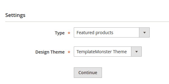
2. In the Settings section in the Type field, select Featured products.
Choose the Design Theme.
3. Press Continue.
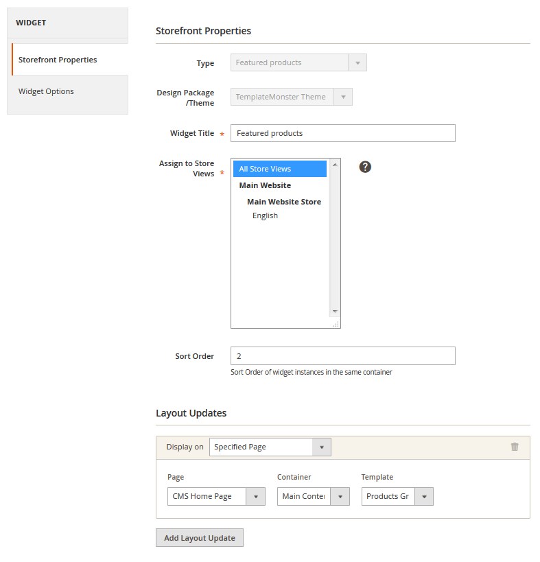
4. Then, fill in all the other fields and specify the place, where you want to display the module in the Layout Updates section.
5. To set up the widget, go to Widget Options section on the left.
6. In this section you should select the product type, which you want to display.
General:
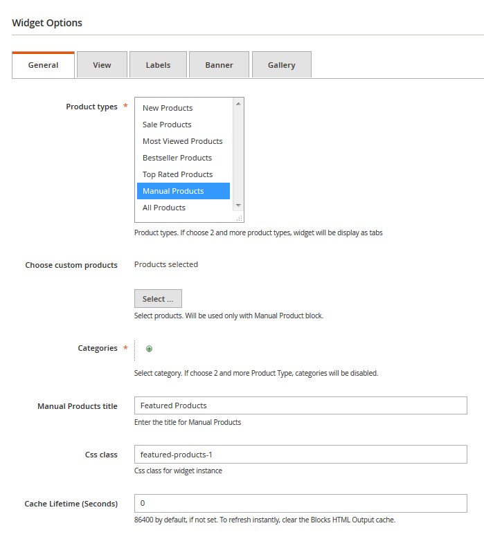
- Product types — choose the product types.
- Chose custom products — select products. The option value will be used in case the Manual Product type is selected.
- Categories — select category. Categories will be displayed, if you select 2 or more Product Types. Press the “+” button, then tap “ellipsis” icon. Click Open Chooser and select the categories to add by checking the box. After, apply the settings.
- All Products title — enter the title for All Products tab.
- Manual Products title — enter the title for Manual Products.
- Top Rated Products title — enter the title for Top Rated Products.
- Bestseller Products title — enter the title for Top Rated Products.
- Most Viewed Products title — enter the title for Most Viewed Products.
- Sale Products title — enter the title for Sale Products.
- New Products title — enter the title for New Products.
- CSS class — specify CSS class for the widget instance. If you want to align all the elements to the center, use products-center.
- Cache Lifetime (Seconds) — change the cache lifetime. (86400 seconds by default)
View:
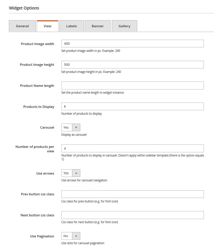
- Product Image width — set the product image width in px. Example: 240
- Product Image height — set the product image height in px. Example: 260
- Product Name length — set the product name length to display within the widget .
- Products to Display — set the number of products to display.
- Products per View — specify the number of posts per view.
- Carousel — enable/disable the carousel (If carousel is enabled a new field will come up).
- Products per View — number of products to display in carousel. Doesn’t apply within sidebar template (there is the option equals 1).
- Use arrows — enable/disable the arrows for carousel navigation.
- Prev button css class — Css class for previous button (e.g. for font icon).
- Next button css class — Css class for next button.
- Use Pagination — you can use dots for carousel pagination.
Labels:
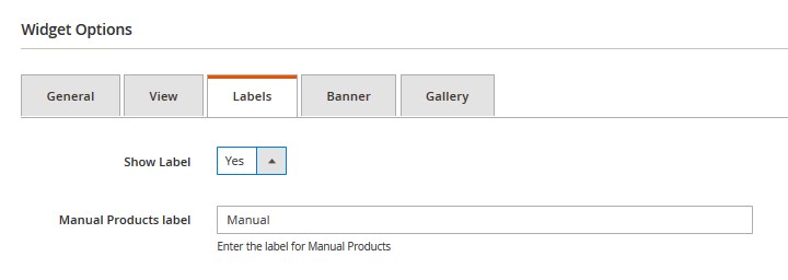
- Show Label — choose if you want to display labels.
- All Products label — enter the text for the “All Products” label.
- Manual Products label — enter the text for the “Manual Products” label.
- Top Rated Products label — enter the text for the “Top Rated Products” label.
- Bestseller Products label — enter the text for the “Bestseller Products” label.
- Most Viewed Products label — enter the text for the Most “Viewed Products” label.
- Sale Products label — enter the text for the “Sale Products” label.
- New Products label — enter the text for the “New Products” label.
Banner:
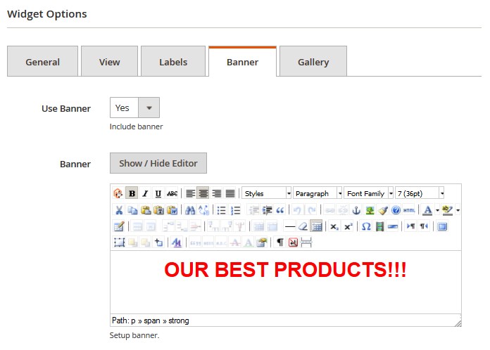
- Use Banner — choose if you you to show the banner.
- Banner — configure the banner. Use Insert Image button. You can add banner content via WYSIWYG editor.
Gallery:
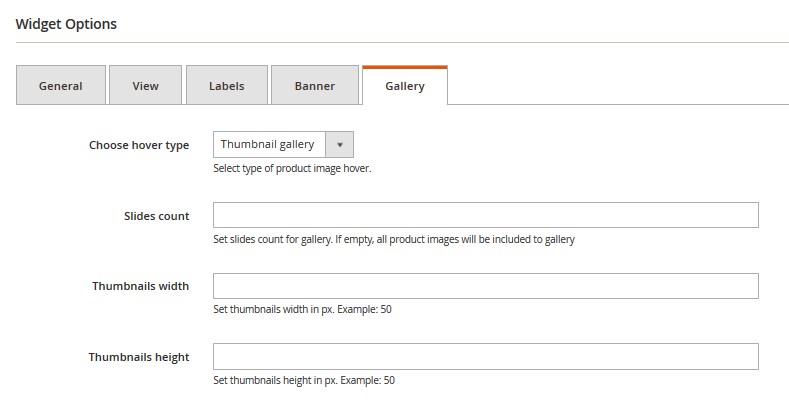
- Choose hover type — select the hover type for the product image.
for Image carousel:
- Slides count — set the number of slides to display. If empty, all product images will be included to the carousel.
for Thumbnail gallery:
- Slides count — set the number of slides to display. If empty, all product images will be included to the gallery.
- Thumbnails width — set thumbnails width in px.
- Thumbnails height — set thumbnails height in px.
When complete, tab Save.
Frontend:
Example 1 (based on the default Magento theme):
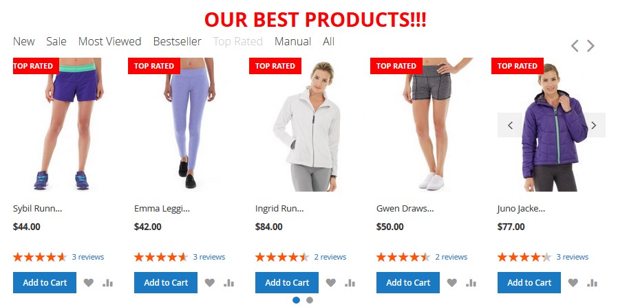
- Type — Featured Products;
- Assign to Store Views — All Store Views;
Layout Update:
- Display on — Anchor Categories;
- Categories — Specific Categories; 23 (Women > Tops > Jackets);
- Container — Main Content Bottom;
- Template — Products List;
- Product types — New Products; Sale Products; Most Viewed Products; Bestseller Products; Top Rated Products; Manual Products; All Products;
- Choose custom products — Joust Duffle Bag; Strive Shoulder Pack; Crown Summit Backpack; Wayfarer Messenger Bag; Rival Field Messenger; Fusion Backpack; Impulse Duffle; Voyage Yoga Bag; Compete Track Tote; Savvy Shoulder Tote;
- All Products title — All;
- Manual Products title — Manual;
- Top Rated Products title — Top Rated;
- Bestseller Products title — Bestseller;
Most Viewed Products title — Most Viewed;
- Sale Products title — Sale;
- New Products title — New;
- Product Image width — 240;
- Product Image height — 240;
- Product Name length — 10;
- Products to Display — 10;
- Carousel — enabled;
- Number of products per view — 5;
- Use arrows — enabled;
- Use Pagination — enabled;
- Manual Products label — Manual;
- Top Rated Products label — Top Rated;
- Bestseller Products label — Bestseller;
Most Viewed Products label — Most Viewed;
- Sale Products label — Sale;
- New Products label — New;
- Banner — enabled (OUR BEST PRODUCTS!!!);
- Choose hover type — Image carousel;
- Slides count — 20.
Example 2 (based on the default Magento theme):
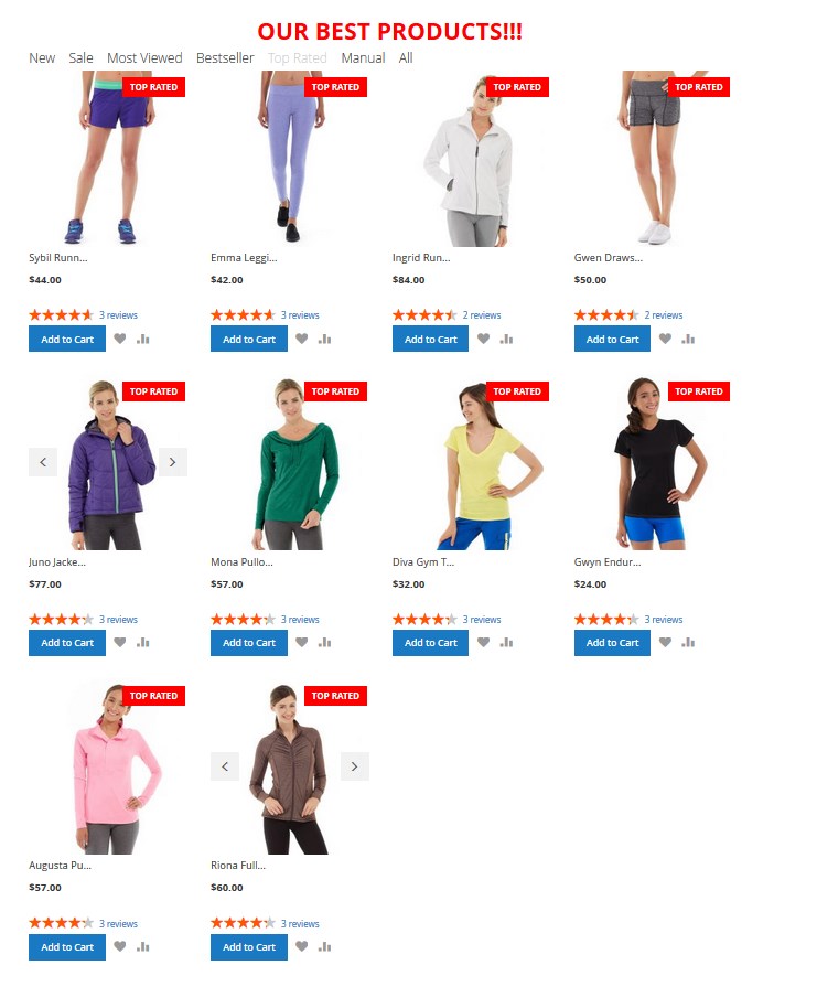
- Template — Products grid;
- Carousel — disabled.
The other settings are the same.
Example 3 (based on the default Magento theme):
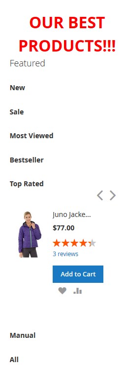
- Template — Products Sidebar;
- Container — Sidebar Main;
- Carousel — enabled;
- Number of products per view — 1.


