
This module is designed to create complex menus. The module provides the ability to display one item (without sub-menu), a menu item with a sub-menu and a menu item with a multi-row and multi-column sub-menu block. The module can be used in different positions, but it will display the same content.
Available positions: top(displayTop), left(displayLeftColumn), right(displayRightColumn), footer(displayFooter). You can add categories (with subcategories), CMS categories (with subcategories), manufacturers (one or a list), suppliers (one or a list), stores (if multistore is used), links to any product, information block about the product, custom links (are not limited in quantity), custom HTML blocks (are not limited in number), furthermore you can add YouTube videos (with the link) and Google Map locations, also not limited.
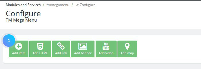
TM Mega Menu module is divided into the sections which are easy to manage. In the first row, you will see the available features that you can add to your menu. Below you will see the rows each containing the items. Also, you can edit the styles of the module. It allows you to create custom look of the Top Level Elements, Badges, First and Next Level Elements along with their links and hover and active conditions.
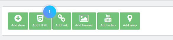
Add an item element
- In your PrestaShop admin panel go to Modules > Modules. In the search field type TM Mega Menu to find the module. To configure existing items you need to click Edit button at the end of the row. To remove an item, click the Delete button.
- To add an item, click the Add item button.
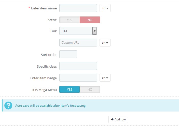
- In the opened window you are able to configure the New Item that will appear in the menu. Let’s review each field:
- Enter item name is required field – show the name of the menu item;
- Active – display the menu item or hide it;
- Link: you can choose between external link, which is URL or existing one, in the first case you will need to paste the URL below, in the second you will need to choose the link from list which appears when you click Existing URL;
- Sort order – show the item in the order you input. For example, if you insert 1, the menu item will be the first on the list;
- Specific class – implement any custom CSS changes to the menu item;
- Enter item badge – use a badge for the menu item. For example, if you have a new category of products, you can type New;
- It is megamenu – use a mega menu for this menu item. It can be easily configured. When you make the Item to be Mega Menu you will be given an option to add the row and then divide it into the columns. The maximum size o the column is 12. Then you will see the user-friendly boxes which allow you to add or remove the content from the list;
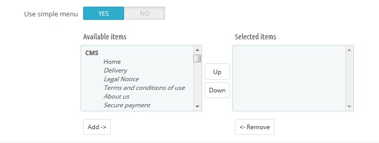
- Use simple menu option to add the sub-menu items. Choose an item which you wish to add from the Available items list, and click Add below to move them to Selected items;
When you finish configuring the menu item, click Save or Save or Stay to confirm the action.
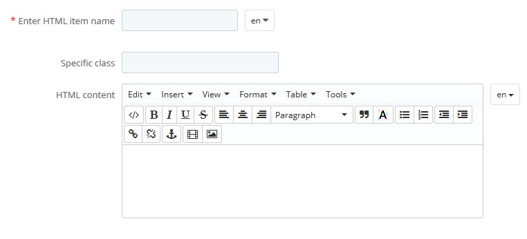
Add HTML element
- These items give you an opportunity to create your custom content with help of HTML. You can add the elements with custom HTML code just clicking Add HTML.
- Then, you will see the list of items:
- Enter HTML item name – the name of a new HTML item (a required field);
- Specific class – assign a custom class to your menu item. You may further use it for the additional CSS rules implementation;
- HTML content – the following editor (listed in above image under ‘3’) is used for your HTML content. You need to paste it right there. It has additional tabs which help you to make it easier to use. If you want to paste the plain HTML you can use the Tools > Source tab to do so.
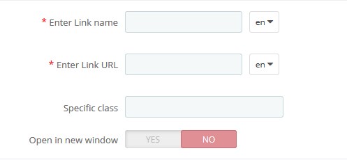
Add Link
The Add Link feature is quite handy if you need to add the menu item and set the link to it without bothering to configure any other fields.
- Enter Link name – the name of an item.
- Enter Link URL – the item URL.
- Specific Class – assign a custom class to your menu item. You may further use it for the additional CSS rules implementation.
- Open in new window – when this option is set to yes, the item opens in a new window when no – in the same.
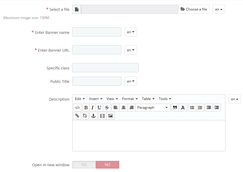
Add Banner
When you need to add menu item with the image, indicating your new category or any other event you can use the banner item. You need to have an image to upload and set the required fields. Click the Add Banner button. Then, you will see the list of items:
- Select a file – browse the image from the computer (a required field). The preferred images for the web are JPEG or PNG types.
- Enter Banner name – the name of the banner, not visible to the customers, preferably should be the same as the Public Title field beneath.
- Specific Class – assign a custom class to your menu item.
- Public Title – the Banner title which will be seen by the customers.
- Description – the same editor as in the HTML feature. It gives you an opportunity to add your custom content to the banner, including the HTML.
- Open in new window – when this option is set to yes, the item opens in a new window when no – in the same.
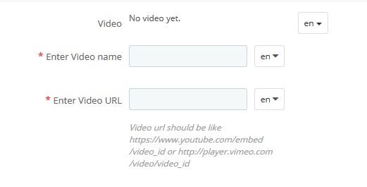
Add Video
The Add Video is a feature that lets you add your custom video form YouTube or Vimeo with the link. This feature has only two fields to fill in:
- Enter Video name – the name of the item.
- Enter Video URL – paste the URL of the YouTube/Vimeo video. You may also check the examples of the links lower this field.
Add Map
With the help of this feature, you can insert the map into your menu.
- Click on the Add Map button. You will see the following fields:
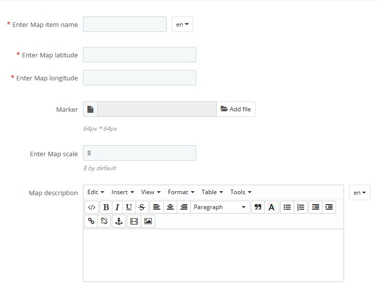
- Enter Map item name – the name of the map you use;
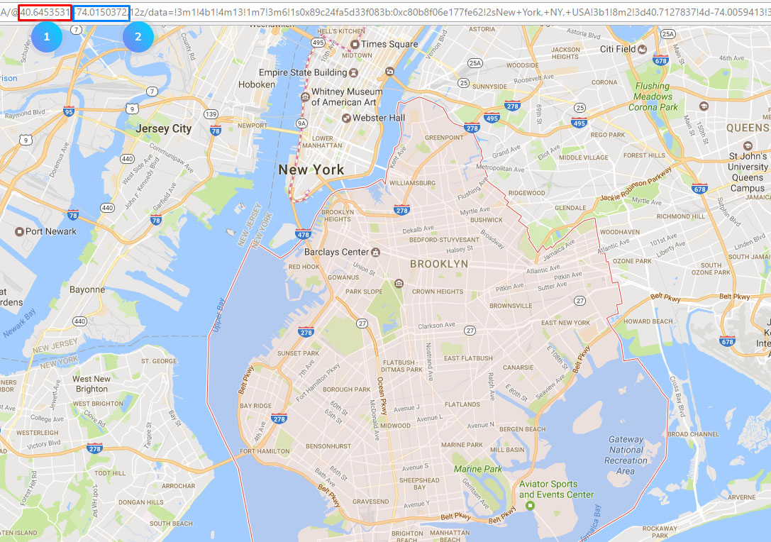
- Enter Map latitude and then Enter Map longitude – these fields are supposed to be filled with the values which indicate your map location, please check the image below. The red under the 1 indicates latitude and blue under 2 shows longitude;
- Marker – requires the icon (small image), preferably PNG or ICO type with 64×64 px dimensions. Click Upload and browse the icon, so it indicates the position on the map;
- Scale – the map zoom. The value must be between 1 and 21, where “21” is the biggest zoom and “1” is the smallest – will show all the globe;
- Map description – custom Map description. You may also use your custom HTML formatting in Tools > Source Code.
[notice type=”warning”]Note: you may need to have the Google API key set to make your Google Maps work properly. Please, see the following link for more info.
We have reviewed all the items and features that you can use in the TM Mega Menu module. You can now manage all your menu items and insert different custom blocks into it.
The Edit Styles tool in the top right corner of the TM Mega Menu editing page. This feature gives you a possibility to apply different styles to all of the items, subitems, fonts and other blocks of your menu.
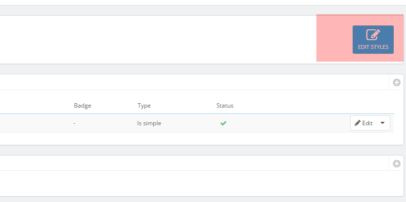
Click on Edit Styles. This opened window shows you different level items which expand and then give you a possibility to edit styles. It has Hover & Active conditions of an item. Hover effect appears when you make the mouse over the element, active is the moment you click on the item.
- Color – the primary color of chosen level item font. So basically if you choose red, your font will change to this color.
- Background color – the color of the background of current level items.
- Background image – alternative to the background color – gives you an opportunity to set the background image.
- Background settings have two fields, the Repeat one allows you to repeat the background-image vertically(repeat-y), horizontally(repeat-x), do not repeat the image, and repeat it both vertically and horizontally.
- Border color – changes each of the borders’ color.
- Border type – set the border dotted, dashed, solid or double borders.
- Border width (px, em) – set the width of the borders with either px value or em one.
- Border radius (px, em) – rounds the corners of the fields.
- Box-shadow makes the shadow to the chosen level. You should paste the following parameters: 0px 0px 0px 0px rgba (0,0,0,0.75) the first and the second parameters define the offset of the shadow, the place the shadow falls. The third parameter is the blur of your shadow, the smaller is the value the less blur you get. The fourth parameter is spread – the amount of shadow(defines its size). The last parameter is the shadow color with RGBA code which gives you a possibility to set the transparency.
The same options are available for each level and each Hover & Active element available in your Mega Menu. Feel free to change them all to meet your needs.
Hopefully, this tutorial was helpful for you.