Style
The main appearance settings of Progress bar. From backgrounds to margins.
Progress Bar
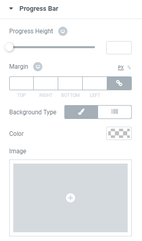
Background Type – here you can set your custom Classic or Gradient background for the progress bar. You will have possibility to customize each type.
Classic Background Type
- Color — using color picker tool set the color of background.
- Image — here you can choose the image you want to use as a background. Select the image from the media library or upload it to define it as a background in this block. When the image is uploaded, you’ll be able to define its position, alignment, turn on repeat and set the necessary size.
Gradient Background Type
- Color — using color picker tool set the color of background for the progress bar.
- Location — here you can set the proportion for the first color in the gradient background.
- Second Color — here you can choose the second color to use in the gradient background.
- Location — you can set the position for the second color in the gradient background.
- Type — define, if you want to use the linear or radial type of the gradient.
- Angle — in this block you can set the angle for the gradient (in degrees).
- Border Type – here you can select the type of the border for the progress bar.
- Width – set the width of the border around the bar.
- Color – using color picker set the color of the border.
- Border Radius – here you can make the border angles more smooth and round setting the radius values.
Box Shadow – the shadow for the progress bar.
Progress Height – here you can specify the height of the progress bar for different devices.
Margin – here you can set the margins on different sides of the progress bar.
Background Type – here you can select the type of the status bar, which can be classic or gradient. The options for both types are different.
Border Radius – here you can make the border angles more smooth and round setting the radius values.
Title Alignment – here you can select the position of title(left, center, right).
Background Type – here you can set your custom Classic or Gradient background for the progress bar. You will have possibility to customize each type.
Border Type – here you can select the type of the border for the title.
Width – set the width of the border around the bar.
Color – using color picker set the color of the border.
Border Radius – here you can make the border angles more smooth and round setting the radius values.
Box Shadow – the shadow for the title.
Padding – here you can set the custom padding for the title to use it on different devices.
Margin – here you can set the margins on different sides of the title.
Position – here you can select the position of the title(left, top).
Icon Color – here you can choose icon color.
Icon Size – here you can set the icon size to make it responsive for different devices.
Text Color – here you can set the color for the title text.
Typography – turn the option on to view the typography settings.
Size — set the font size of the progress bar title.
Family — here you can set the font family for the title.
Weight — in this block you can select the font weight.
Transform — here you can choose from the dropdown menu how it will be shown(uppercase, lowercase,capitalize, normal).
Style — in this block you can choose from the dropdown menu the style of the font. It can be normal, italic (the characters look similar to handwriting) and oblique (the characters are slightly inclined to the right).
Line Height — set the height of the slide title line.
Letter Spacing — here you can set the space between letters.
Percent Width – here you can set the width of the percents block to make it look good on different devices.
Background Type – here you can set your custom Classic or Gradient background for the progress bar. You will have possibility to customize each type.
Border Type – here you can select the type of the border for the title.
Width – in this block you can set the border width in px.
Color – here you can define the color of the border.
Border Radius – here you can make the border angles more smooth and round setting the radius values.
Box Shadow – the shadow for the percentage.
Margin – here you can set the margin to use it for the percents on different devices.
Padding – here you can apply your custom padding values to the percents.
Text Color – using the color picker change the color of the percents.
Typography – turn the option on to view the typography settings. They are similar to all of the Typography blocks.
Prefix Font Size – here you can define the size of the % sign to make it responsive for all devices and screens.
Percent Suffix Alignment – change the suffix alignment(top, center, bottom)
Now your Progress bar looks much better, thanks to the possibility of fine tuning.
Status Bar
This paragraph will help you to set up your Status bar.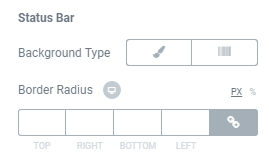
Title
Settings for all things which relate to Title.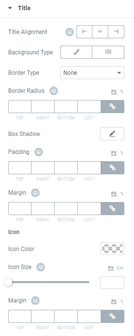

Icon
Make changes with Icon settings. It will help you to customize your Icon.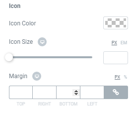
Text
Here you can find all what you need to make your Text on page better.
Let’s start with Text color.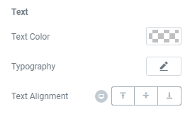
Percent
All settings related to the appearance of percentage. From the most basic to the smallest details.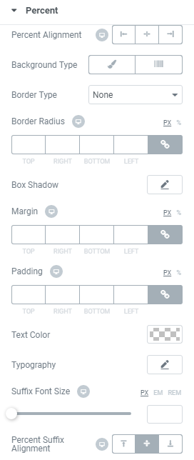
Style
Progress bar has a lot of settings which will help you make all types of changes.