
In the ever-evolving landscape of brand representation, logos stand as the visual ambassadors of a company’s identity. As consumers navigate through a myriad of products and services, the need for a distinctive and memorable brand presence becomes paramount. In this pursuit, minimalism in logo design has emerged as a guiding principle, reshaping the way businesses communicate their essence. The minimalist approach, characterized by simplicity and a focus on essential elements, has gained traction for its ability to cut through the noise and leave a lasting imprint on the minds of consumers. This article delves into the principles that underlie minimalist design, explores the tangible benefits it brings to brand recognition, and examines real-world case studies that highlight the triumphs of minimalist logos in the competitive arena of contemporary branding. As we unravel the nuances of this design philosophy, it becomes evident that in today’s fast-paced and visually saturated world, the adage “less is more” holds profound relevance in the realm of logo design.
Principles of Minimalist Design
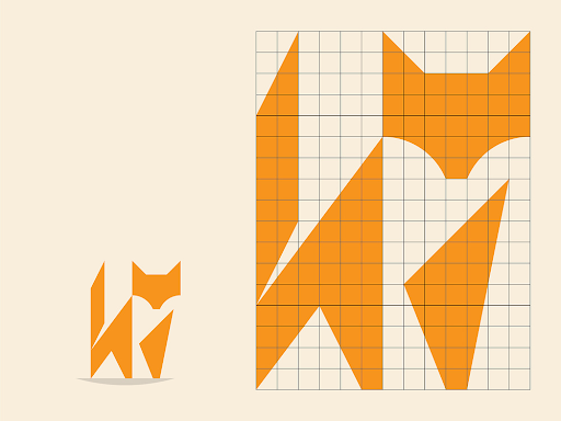
At the core of minimalist design lies a commitment to simplicity, a deliberate paring down to the essentials. The driving force behind this design philosophy is the belief that by eliminating extraneous elements, the message becomes clearer and more impactful. In the realm of logo design, simplicity doesn’t equate to a lack of creativity; rather, it is about distilling the brand’s essence into a visual representation that resonates with the audience.
Minimalist logos often embrace clean lines, uncomplicated shapes, and a restrained color palette. This intentional reduction of visual elements ensures that the logo remains uncluttered and easy to interpret. Negative space, an integral aspect of minimalist design, is strategically harnessed to create a visual balance that guides the viewer’s focus to the essential components of the logo. Logo generator Turbologo provides the ability to create animated logos.
Furthermore, the principle of versatility is embedded in minimalist design. A minimalist logo should be effective whether scaled down on a business card or magnified on a billboard. The adaptability of these designs ensures that the brand maintains its visual identity across diverse platforms and sizes, contributing to a seamless and recognizable brand experience.
In essence, the principles of minimalist design in logo creation revolve around the art of subtraction – removing the non-essential to reveal the core message with clarity and precision. This disciplined approach not only fosters a visual identity that stands the test of time but also facilitates a deeper connection between the brand and its audience through a distilled and potent visual language.

Benefits of Minimalism in Brand Recognition
The adoption of minimalist design principles in logo creation offers an array of advantages, all of which contribute significantly to brand recognition and consumer engagement.
One notable benefit is the enhanced memorability of minimalist logos. In a world bombarded with visual information, simplicity stands out. Minimalist designs distill the brand’s identity into a succinct and memorable visual, making it easier for consumers to recall and identify. The reduction of elements to the most essential allows the logo to etch itself into the minds of the audience, creating a lasting impression.
Versatility is another compelling advantage of minimalist design in the context of brand recognition. These logos transcend various mediums and applications seamlessly. Whether displayed on a website, a mobile app, or a physical product, the simplicity of minimalist logos ensures their clarity and impact, fostering a consistent and recognizable brand presence across diverse platforms.
The timeless quality of minimalist logos further contributes to their effectiveness in brand recognition. While design trends come and go, minimalist logos possess an enduring aesthetic appeal. This longevity ensures that the brand remains relevant and visually appealing throughout evolving market landscapes, establishing a sense of trust and stability with consumers.
Moreover, the scalability of minimalist logos is a crucial factor in their success. As businesses expand their reach, their logos must adapt to different sizes and contexts. The inherently scalable nature of minimalist designs ensures that the logo remains legible and impactful, whether on a small business card or a large billboard, maintaining a cohesive and recognizable brand image.
In summary, the benefits of minimalism in brand recognition are multifaceted. From heightened memorability to versatile application, timelessness, and scalability, minimalist design principles empower logos to communicate effectively in the ever-evolving visual language of the modern consumer landscape.
Case Studies of Minimalist Logo Success
Examining real-world examples provides concrete evidence of the impact and success that minimalist logo designs can achieve in the competitive landscape of branding.
- Google:
Google, a tech giant synonymous with innovation, underwent a transformative rebranding in 2015. The company streamlined its logo, opting for a clean, sans-serif typeface and bright primary colors. The minimalist approach not only modernized Google’s visual identity but also reflected the company’s commitment to simplicity and user-centric design. The minimalist redesign contributed to reinforcing Google’s global recognition, showcasing how a simple yet vibrant logo can resonate with users worldwide.
- McDonald’s:
In 2003, McDonald’s made a significant shift in its branding by adopting a more minimalist approach to its iconic Golden Arches. The double-arched symbol, a universally recognized emblem of the fast-food giant, became sleeker and more streamlined. This subtle redesign retained the brand’s heritage while presenting a contemporary and simplified image. The minimalist adaptation of the Golden Arches illustrates how even established brands can leverage simplicity to stay relevant and visually appealing.
These case studies emphasize that minimalism is not limited to startups or specific industries; it is a versatile design strategy that can be successfully applied across diverse sectors. Both Google and McDonald’s showcase how a commitment to simplicity, even in the modification of established logos, can yield positive results in terms of brand recognition, modernity, and resonance with a contemporary audience.
In each case, the minimalist redesigns didn’t just alter the visual aspects of the logos; they communicated a shift in brand philosophy and values, aligning the visual identity with the evolving expectations of consumers in a rapidly changing world. These success stories underscore the transformative potential of minimalist design in the realm of brand recognition and customer loyalty.
In the dynamic landscape of branding and logo design, the principles of minimalism stand as a beacon of clarity and effectiveness. Through the exploration of minimalist design principles, the benefits they offer in brand recognition, and the examination of successful case studies, it becomes evident that “less is more” holds significant value in today’s branding endeavors.
Minimalist logos, with their simplicity and focus on essential elements, possess a unique ability to cut through the noise of modern marketing and leave a lasting impression on consumers. They embody the ethos of their respective brands with precision and clarity, fostering memorability, versatility, timelessness, and scalability.
As businesses strive to differentiate themselves in a crowded marketplace, embracing minimalism in logo design offers a strategic advantage. By distilling their brand identity into clean, uncluttered visuals, companies can communicate their message effectively and resonate with their target audience on a deeper level.
The case studies of minimalist logo success stories such as Google and McDonald’s serve as a testament to the enduring power of simplicity in branding. These examples highlight how minimalist design can not only enhance brand recognition but also reflect the values and vision of the companies they represent.
In conclusion, minimalism in logo design is not merely a trend; it is a timeless philosophy that transcends aesthetics to become a strategic tool for building strong and memorable brands in the ever-evolving landscape of modern business. By embracing the principle of “less is more,” companies can create logos that resonate with consumers, stand the test of time, and leave a lasting legacy in the minds of their audience.