
From this tutorial you’ll learn how to utilize Images Layout JetElements module style for Elementor.
Style
In this block, you can change style and appearance settings for Image Layout module, define items padding, alignment, additional elements color, etc.
General 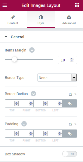
- Items Margin — drag the controller rightwards and leftwards to specify the preferable item’s margin.
- Border Type — here you can define the needed border type for the module. It can be dotted, dashed, double or solid.
- Border Radius — here you can define the values for the radius of the selected border.
- Padding — here you can set the preferable custom padding for the module is displayed. Fill in the values for the top, bottom, right and left padding in pixels to apply your custom padding.
- Box Shadow — enable this option if you want to access the shadow advanced settings for this module, and need to apply shadow for it.
Icon 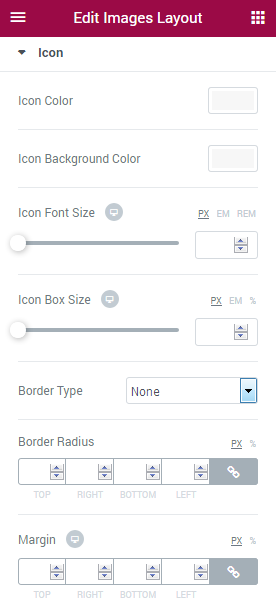
- Color — here you can set the color of the module icons using color picker tool.
- Background Color — here you can set the background color for the icon using color picker tool.
- Font Size — here you can define the font size of the icon symbol.
- Box Size — define the box size of the module icon.
- Border Type — here you can define the type of the border you need to use for the icon element.
- Border Radius — here you can define the values for the radius of the selected icon border.
- Box Shadow — enable this option if you want to access the shadow advanced settings for the icon, and need to apply shadow for it.
- Horizontal Alignment — select central, left or right alignment for the icon.
- Vertical Alignment — select central, left or right alignment for the icon.
Title 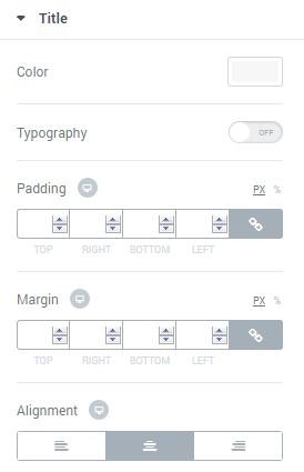
- Color — here you can set the color of the module titles using color picker tool.
- Typography — turn the option on to view the typography settings.
- Padding — here you can set the preferable custom padding for the titles. Fill in the values for the top, bottom, right and left padding in pixels to apply your custom padding.
- Alignment — set the centered, left or right alignment for the title.
Description 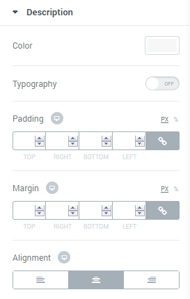
- Color — here you can set the color of the module descriptions using color picker tool.
- Typography — turn the option on to view the typography settings.
- Padding — here you can set the preferable custom padding for the descriptions. Fill in the values for the top, bottom, right and left padding in pixels to apply your custom padding.
- Alignment — set the centered, left or right alignment for the description.
Overlay 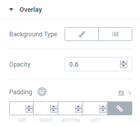
- Background Type — in this block you can choose, whether you want to use classic or gradient type for the module overlay. The customization options vary for each type.
Classic Background Type
- Color — here you can set the background color for the overlay using color picker tool.
- Image — here you can choose the image you want to use as a background. Select the image from the media library or upload it to define it as a background in this block. When the image is uploaded, you’ll be able to define its position, alignment, turn on repeat and set the necessary size.
- Opacity — here you can define the value for the opacity of the background.
Gradient Background Type
- Color — here you can set the background color for the overlay using color picker tool.
- Location — here you can define the proportion for the first color in the gradient background.
- Second Color — here you can set the second color to use in the gradient background.
- Location — here you can define the proportion for the second color in the gradient background.
- Type — define, if you want to use a linear or radial type of the gradient.
- Angle — in this block you can set the angle for the gradient (in degrees).
- Opacity — here you can change background opacity, where 1 is 100% opacity, and 0 — is 0% opacity.
- Padding — here you can set the preferable custom padding for the overlay. Fill in the values for the top, bottom, right and left padding in pixels to apply your custom padding.
Content Order and Alignment 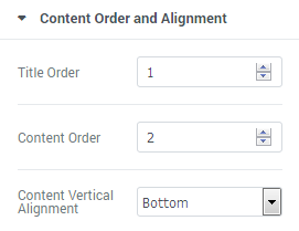
- Title Order — here you can set the order number to display the title first or second.
- Content Order — here you can set the order number to display the content first or second.
- Content Vertical Alignment — here you can set the top, centered or bottom content alignment.