
Today, we will learn how to manage TM Slick Carousel module.

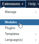
Modules list is located in Extensions => Modules section in the admin panel.
If you prefer adding a new module, please click the New button, located in the top right corner of the page. Select the TM Slick Carousel module from the list.
Title field denotes the module name.
The first tab is Module. It consists of two columns.
The left one includes following fields: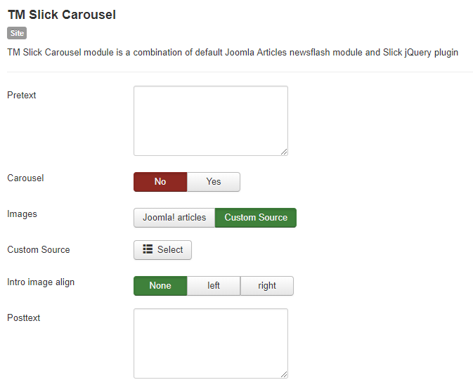
- Pretext – is the text that will be displayed under module title on the page.
- Carousel toggle – includes No and Yes options, which define whether module content will be displayed in slider form or items will be static.
- Images toggle – allows selecting items from Joomla! Articles, which are located in Content => Articles section in the admin panel or from a custom source.
- Custom Source – is a selector field, that allows uploading images from your computer.
- Intro image align – defines the way module intro image will be aligned. Available options are following: None, Left and Right.
- Posttext field – defines the text, that will be displayed after module items on the website.
Right column includes: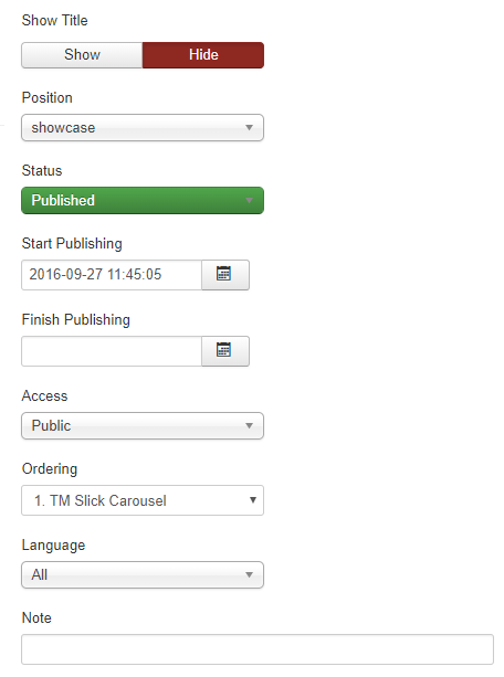
- Show title – defines if module title will be displayed or not. Includes Show and Hide toggle options.
- Position drop-down shows in what location on the page module will be displayed.
- Status – this field specifies whether the module will be displayed on the website if the Published status is selected or not if the Unpublished one is active. The Trashed option is active if the module is removed from the website.
- Start Publishing field defines when the module is published and Finish Publishing specifies the date when the module is unpublished, respectively.
- Access drop-down allows displaying a module only to a specific users group. It contains the following options: Guest, Public, Super Users, Registered, Special.
- Ordering specifies the module position in a specific location on the website. This option is especially useful when there are multiple modules, assigned to the position, which should be displayed in a particular order.
- Language drop-down defines for which languages module will be displayed. This field is very useful when configuring multilanguage website.
- Note field allows adding a note text to the module.
Let’s move on to the next tab, which is Menu Assignment.
Here the user can select where exactly module will be displayed. Module can be assigned to the following positions:
- Only on the pages selected allows showing the item only on preferred pages.
- On all pages, when the module will be shown on every page in the defined position.
- when No pages option is selected, module won’t be displayed on the website, but will still be available in admin panel in the specified position.
- On all pages, except those selected option allows excluding module only from specified pages.
Menu Selection contains a list of all the available pages on the website with checkboxes.
Next tab is Module Permissions, which lets the user manage permissions for each user group.
Left column consists of all user groups and right one contains all the available actions for each group, which are following:
- Inherited means that default permissions from global configuration, parent group and category will be used.
- Denied means that no matter what the global configuration, parent group or category settings are, the group being edited can’t take this action on this item.
- Allowed means that the group being edited will be able to take this action for this item.
Advanced tab contains extra module settings:
- Alternative Layout – allows selecting a specific layout for the module.
- Module Class Suffix – this parameter lets adding a new module class or editing the existing one.
- Caching – sets a caching type for the module. Available options are Use Global and No Caching.
- Module Tag – allows adding tags to the module for better content organizing purposes.
- Bootstrap Size – specifies the number of bootstrap columns that module takes.
- Header Tag – defines the module header style, assigned to each specific tag size.
- Header Class – in this field a custom class can be assigned to module header.
- Module Style – here you can select a style for your module by assigning a layout for it from a different theme.
Last, but definitely not least is Slick Options tab, which contains all the actual slider settings and effects: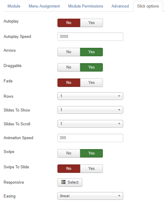
- Autoplay – defines whether the carousel autoplay is enabled or not.
- Autoplay Speed – allows setting the speed for items being displayed before moving to next slide.
- Arrows – specifies whether navigation is enabled.
- Fade – defines whether images and introtext for each item will have a fading effect.
- Rows – this field lets you set how many rows will the carousel display on the website.
- Slides To Show – specifies a number of slides, displayed in your slider.
- Slides To Scroll – sets a number of slides to scroll through.
- Animation Speed – in this field you can set the speed for slides transition.
- Swipe – defines if swiping option is enabled for touchscreen devices.
- Swipe To Slide – lets you enable swiping through slides manually on touchscreen devices.
- Responsive – defines if module layout is responsive.
- Easing – specifies the easing animation when changing slides.
After filling in all the necessary fields, click the Save button in the top left corner of the screen to save all the changes you have made.
Well done, you have got to the end of this tutorial and we have learned how to manage TM Slick Carousel module.